Florida and the Dortmunder U sharpen the brand for internal and external communication
Art and culture, Branding, Corporate Design, Custom Type Design, Design Manual, Development, Logo Design, Strategy, Webdesign
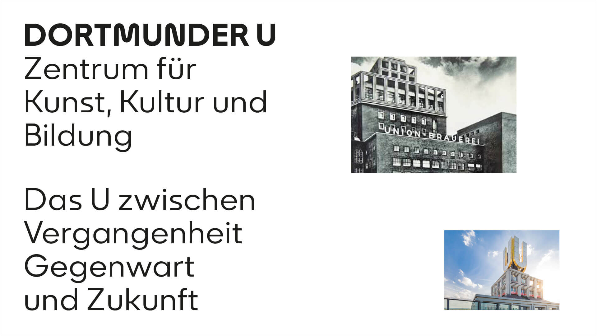
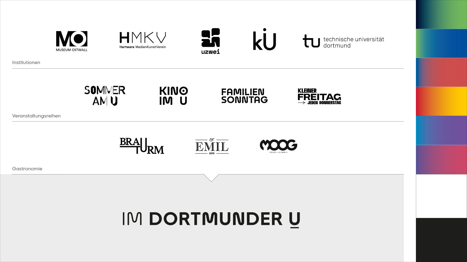
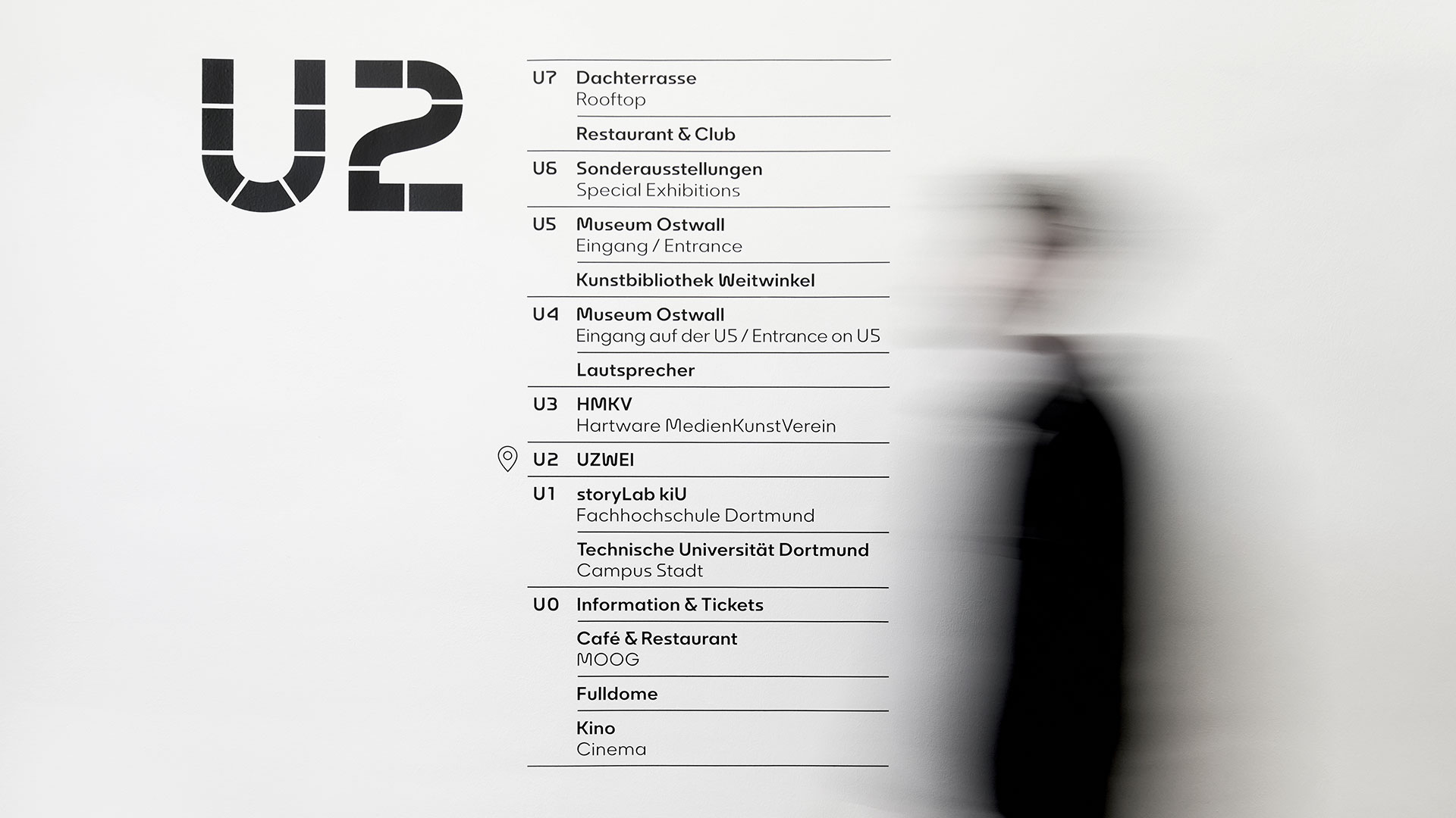
The Dortmunder U is home to five institutions, four event series and three gastronomies whose interests create the framework for everything from art and cultural education to concerts, cinema and steaks. As a beacon for art and culture in the city of Dortmund, the Dortmunder U must also manage the balancing act between art connoisseurs and potential new visitors. The redesign of the brand focuses fully on optimising communication between sender and receiver and a more easily understandable hierarchy of the different roles and locations.
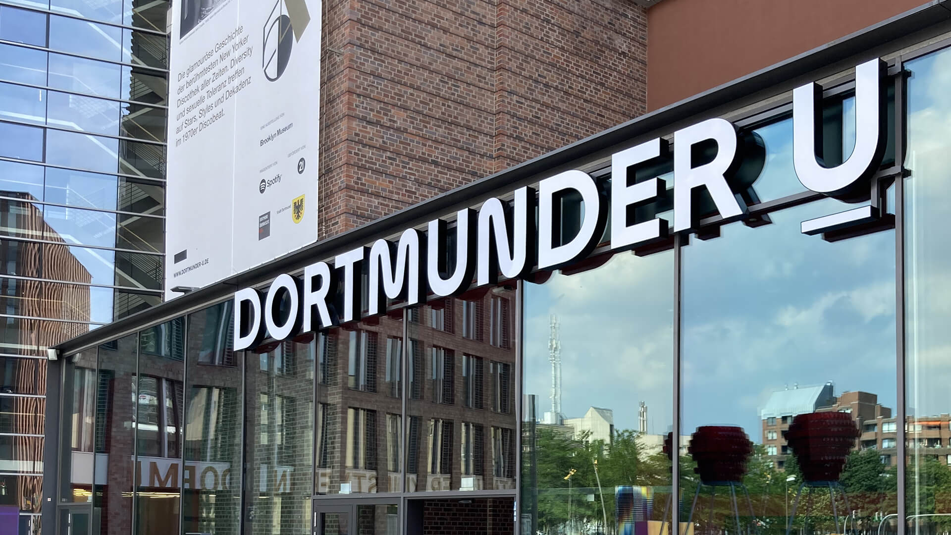
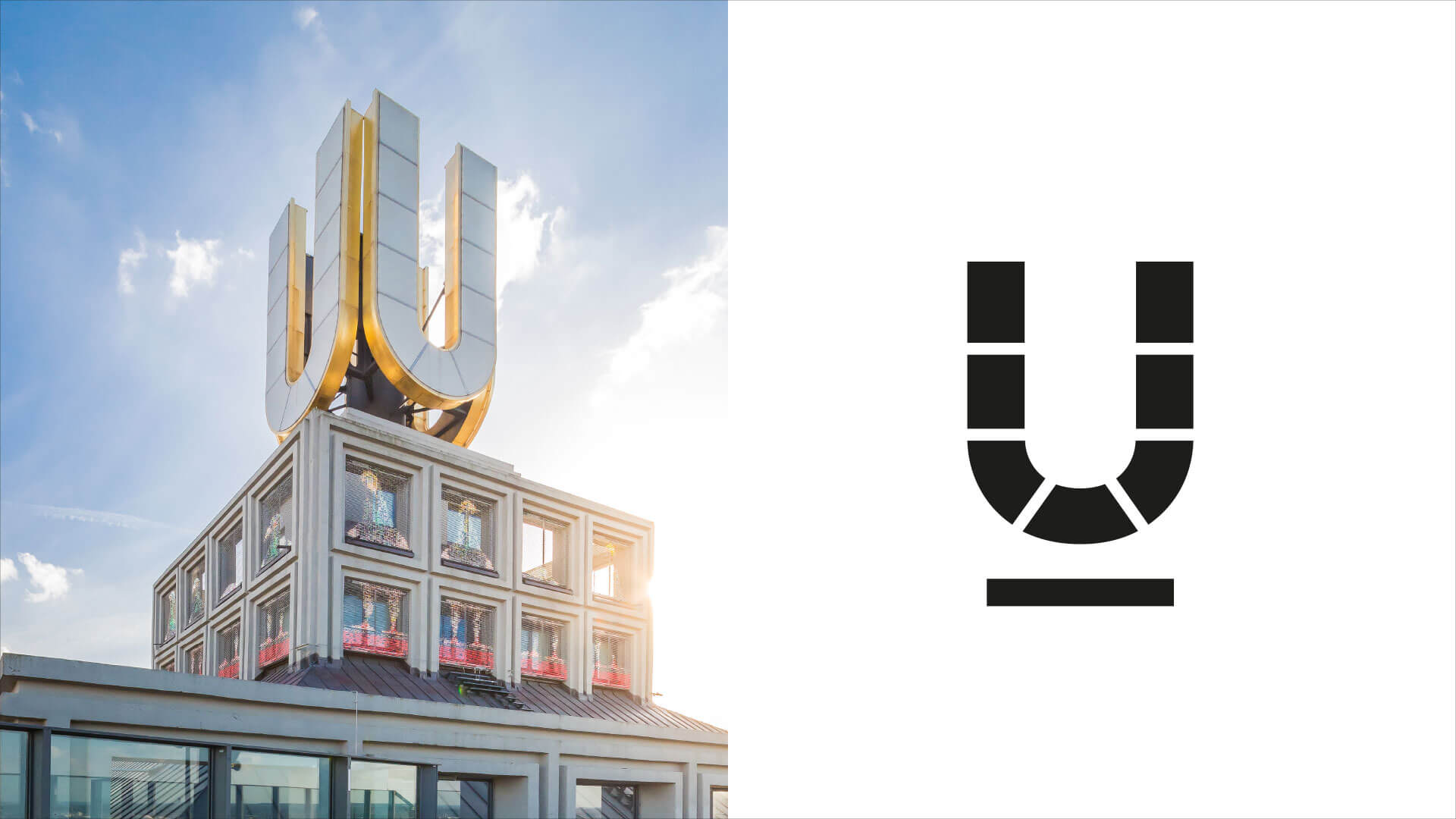
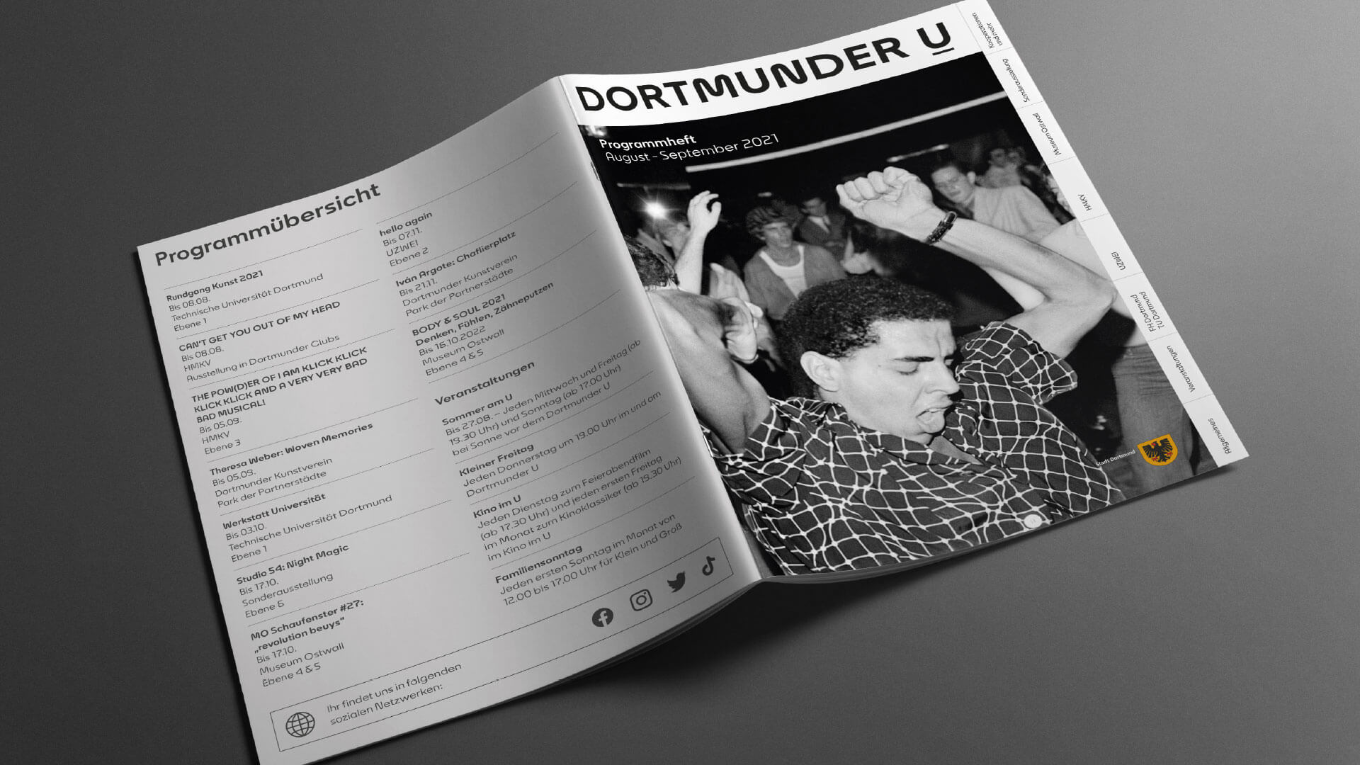
From the U to the Dortmund U
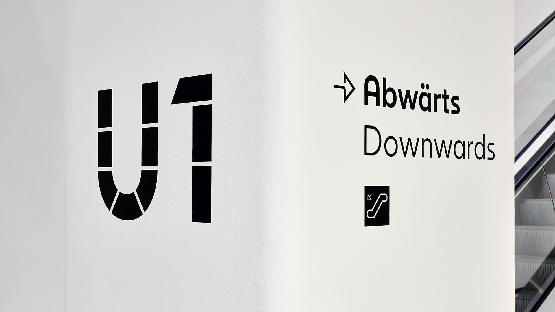
The basis of the brand redesign was the transformation of the iconic “Us” from a singular signet to a word mark. The background to this strategically conceived decision was the proven finding that a faster and more comprehensible assignment of the location for the various target groups goes hand in hand with a clear mention of the house name.
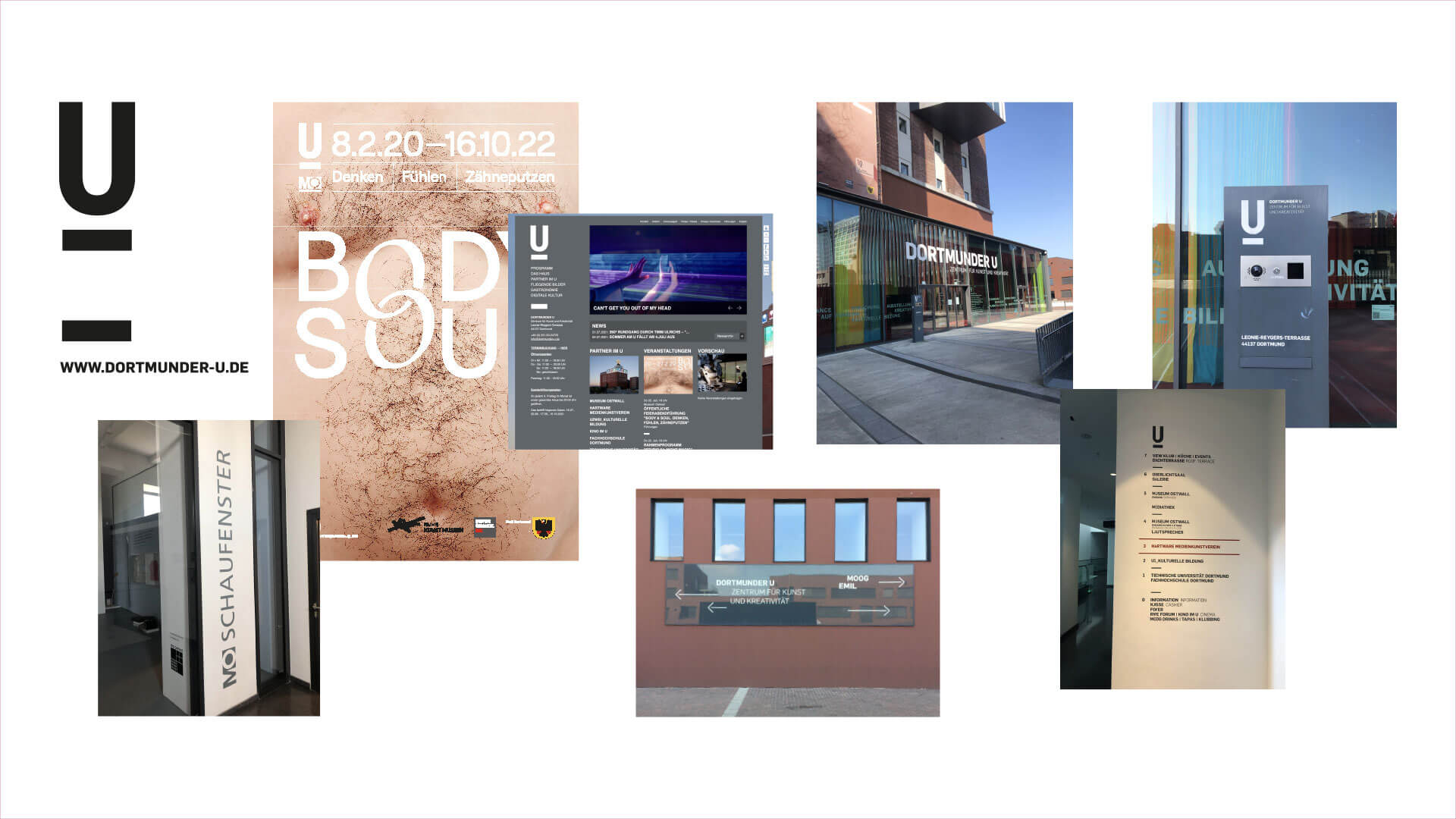
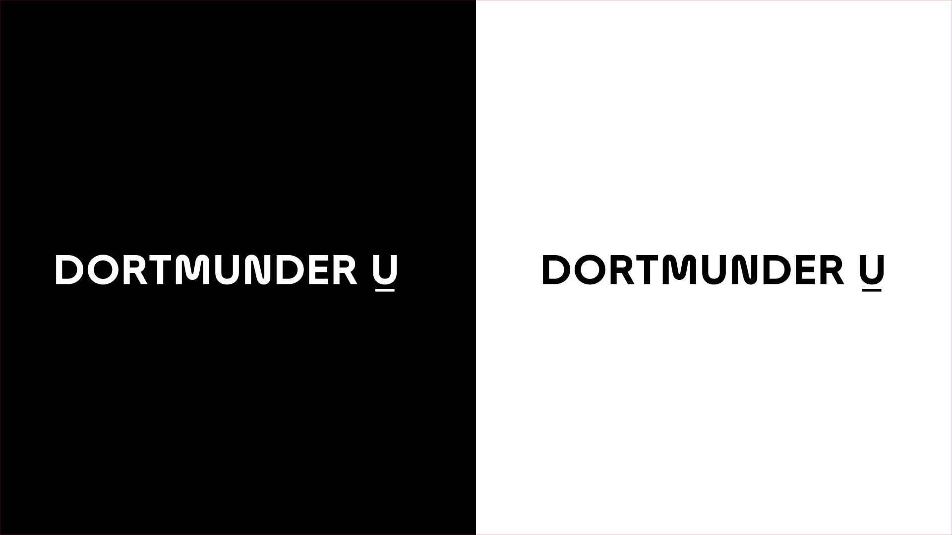
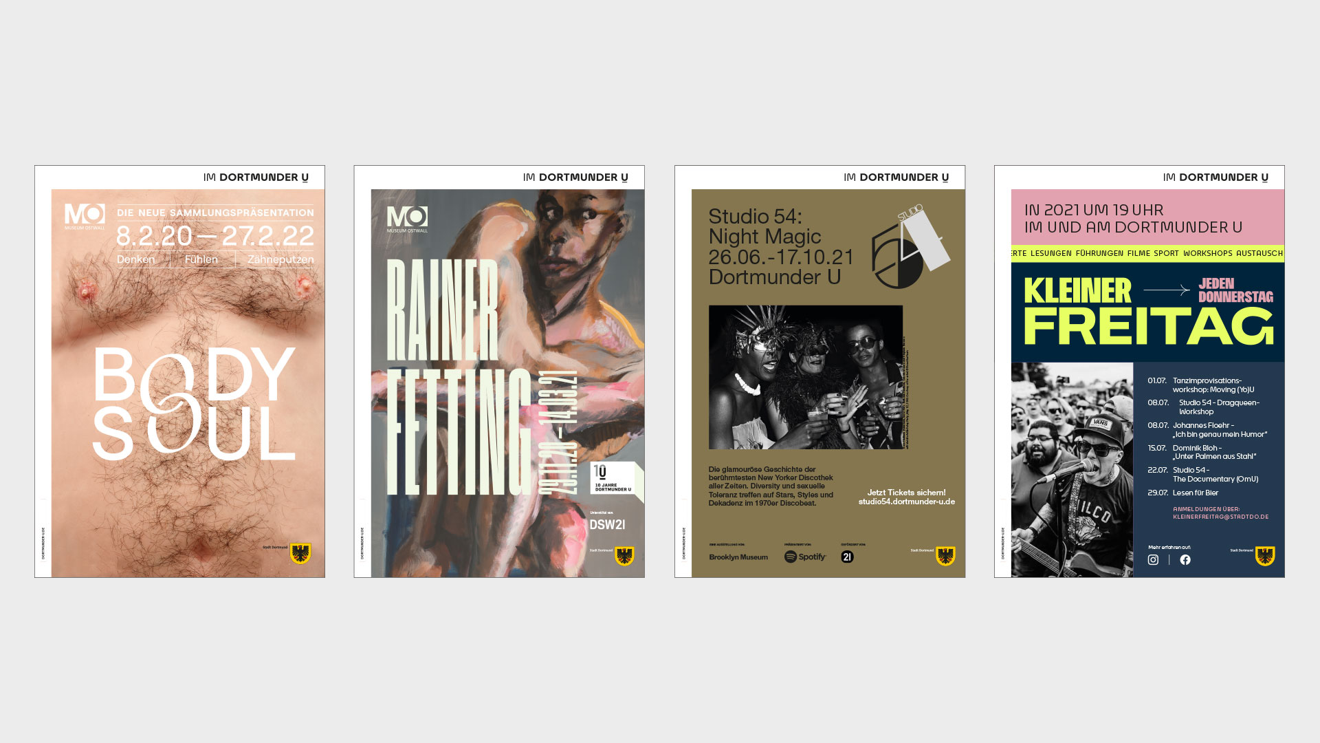
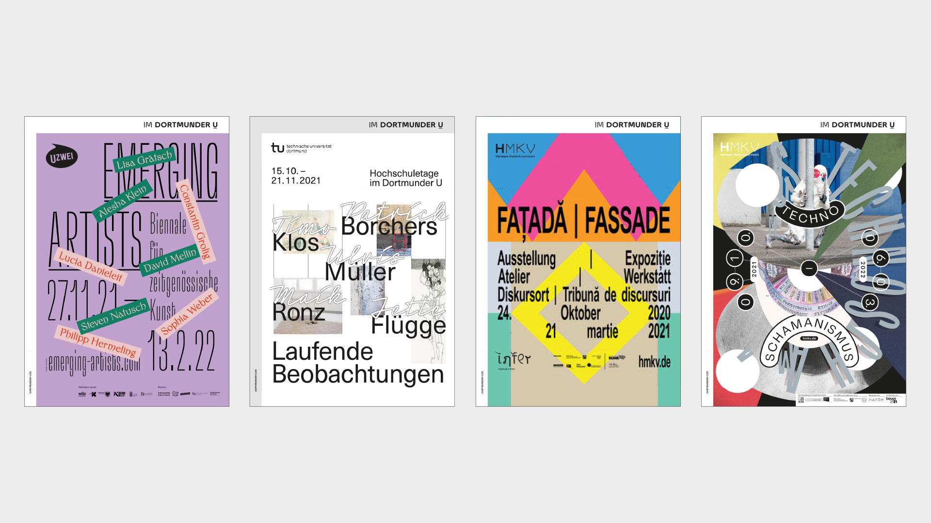
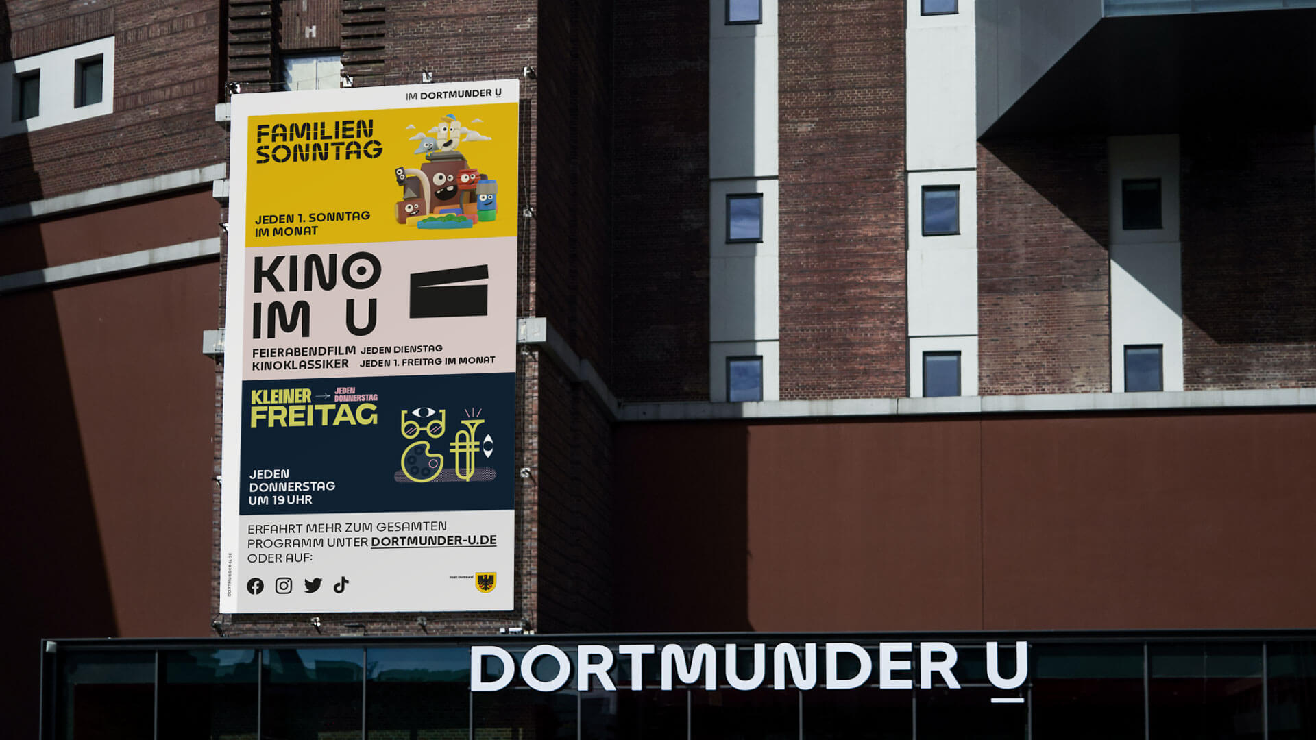
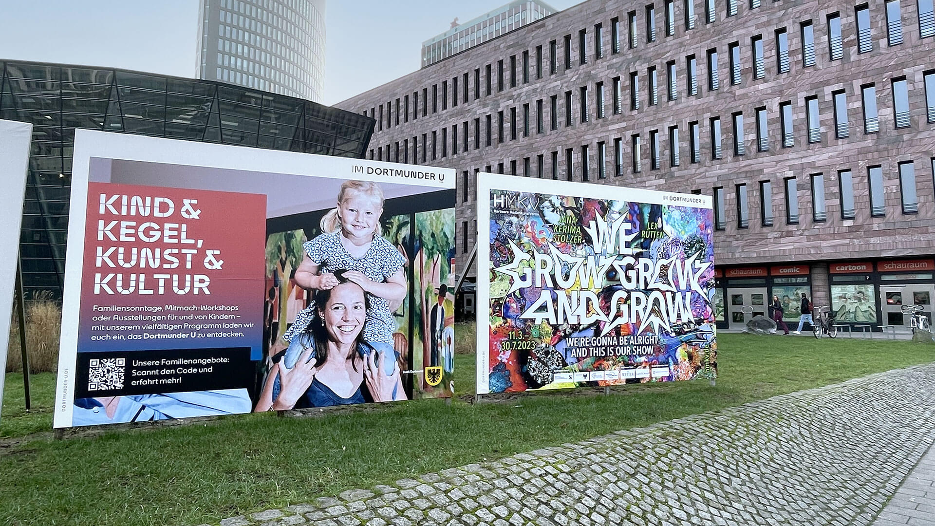
Another important decision was the clear reduction of colours and the resulting visual separation between the house (Dortmunder U) and the various actors (institutions, exhibitions, gastronomies, event formats, etc.).
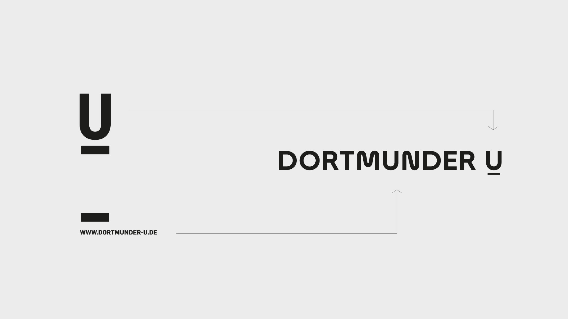

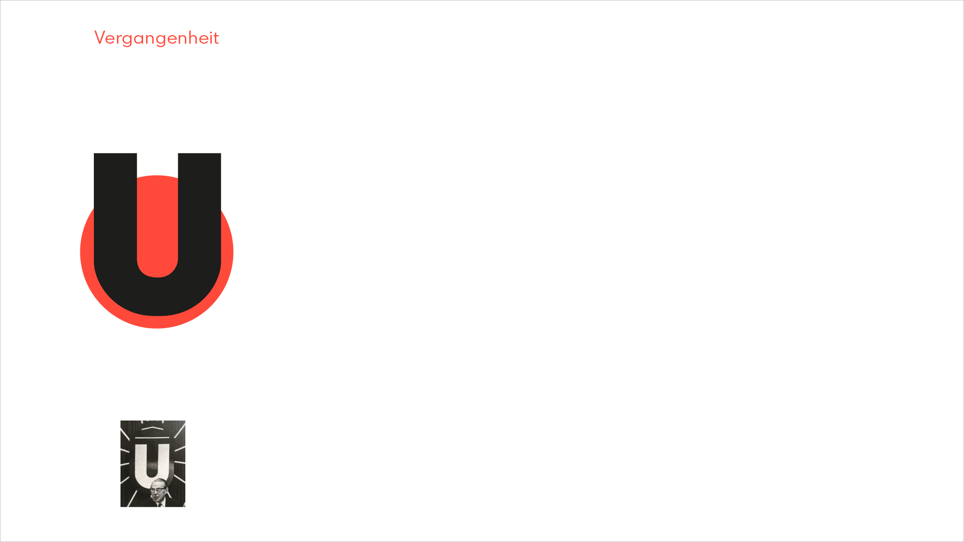
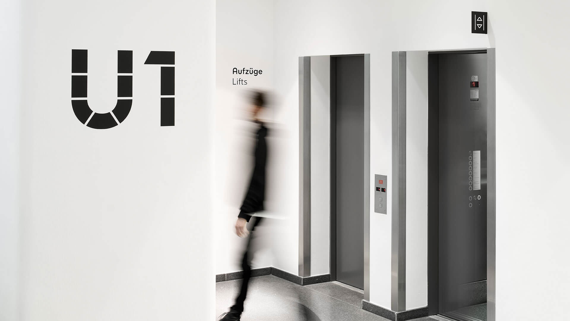
In the beginning was the U
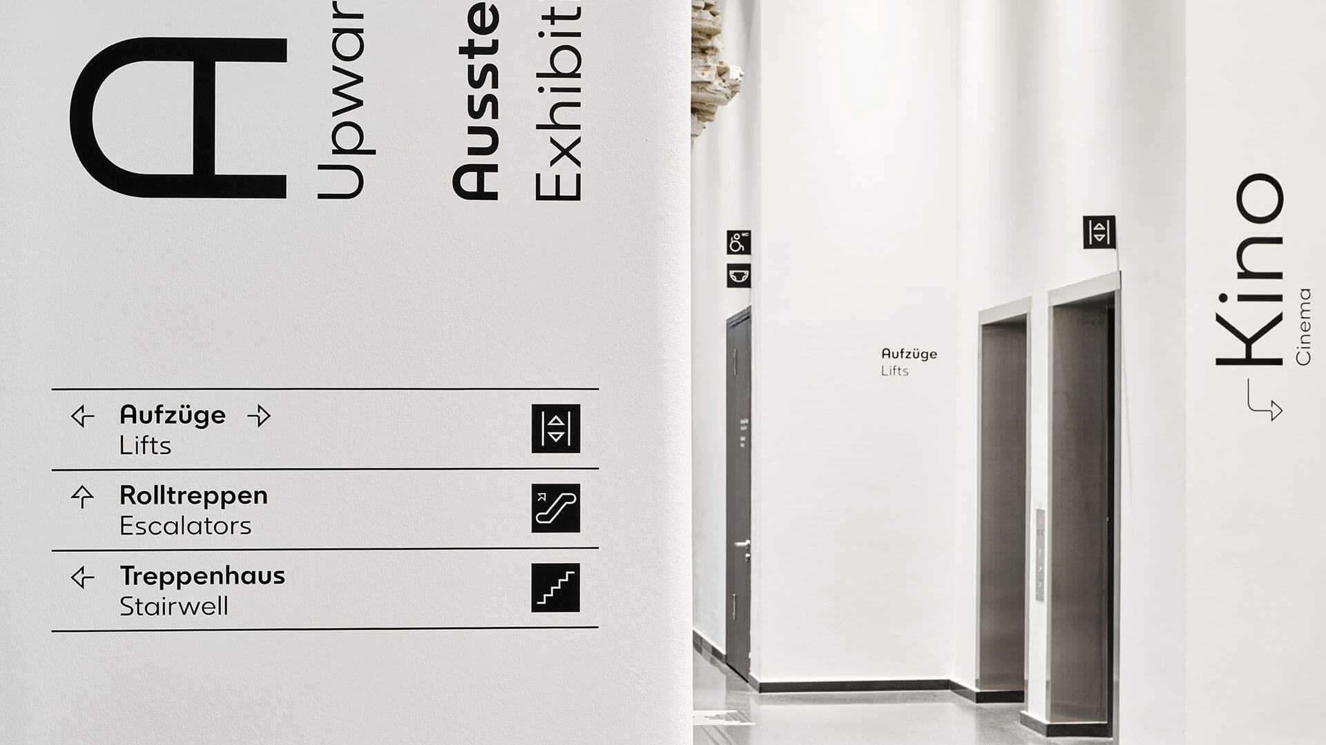
In addition to legibility and clear communication, the playful element in the form of the iconic letter must not be missing. The static old logo is replaced by a modern and dynamic signet that can be used variably and clearly translates tradition into the future.
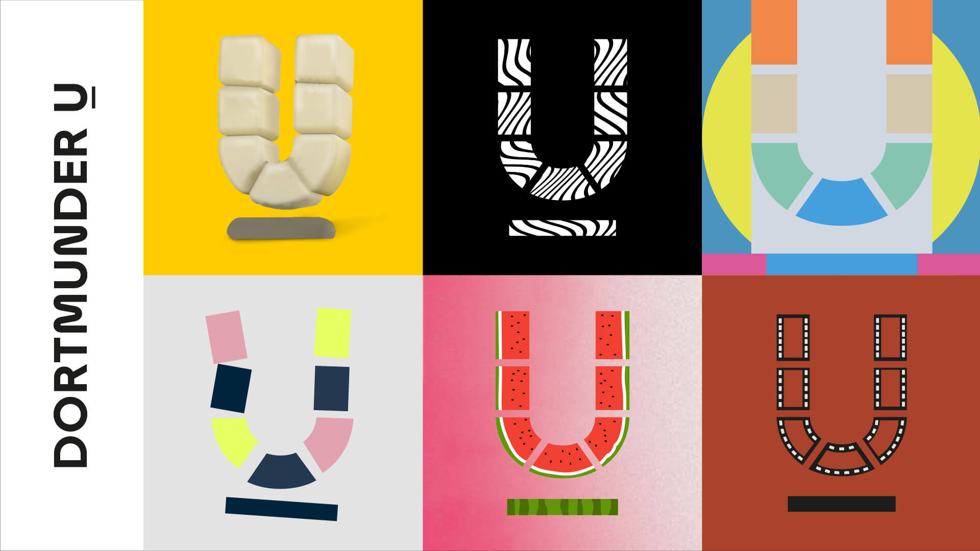
Brand character through individuality.
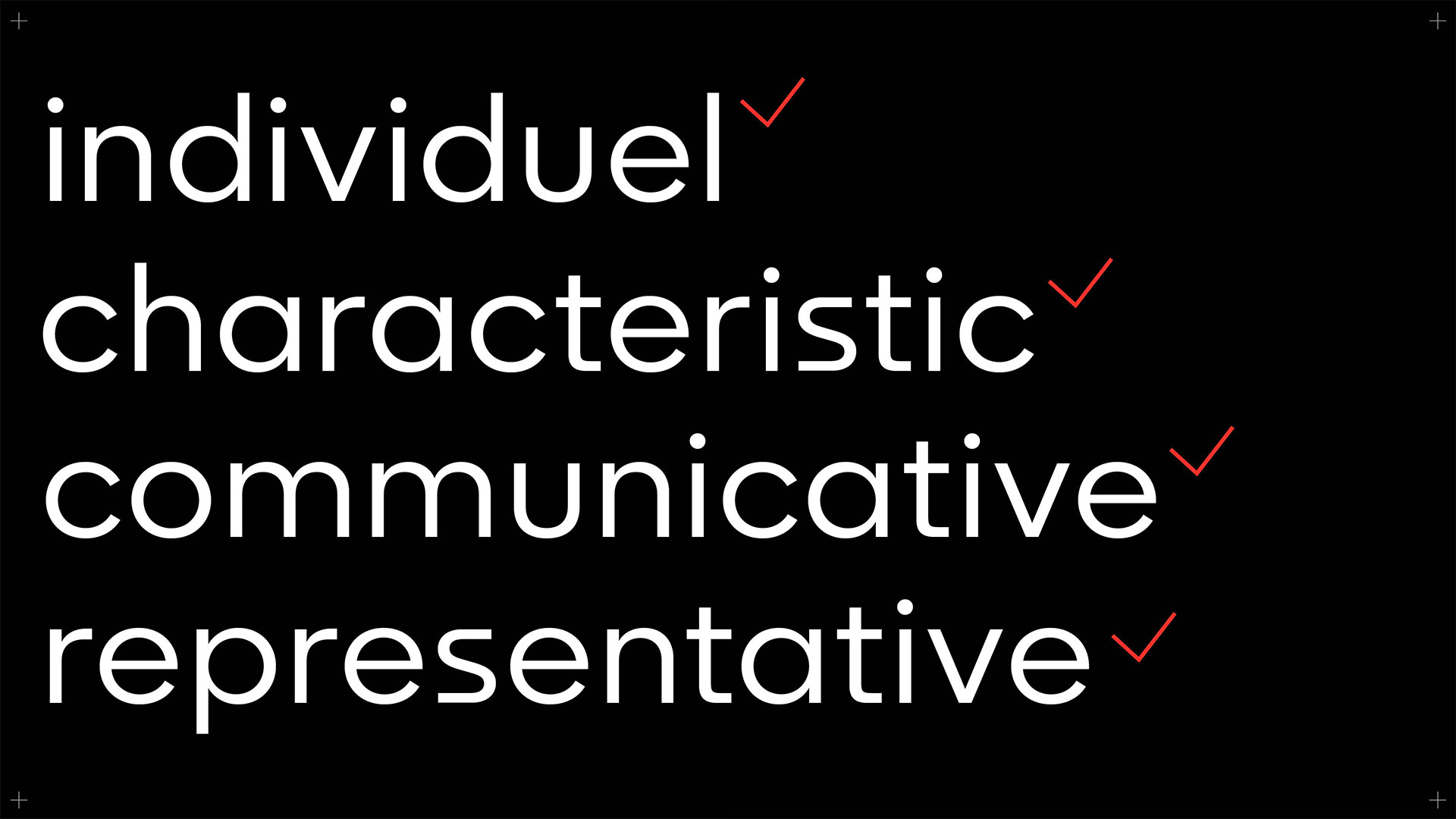
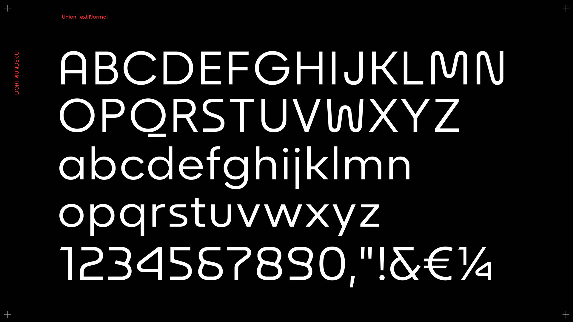
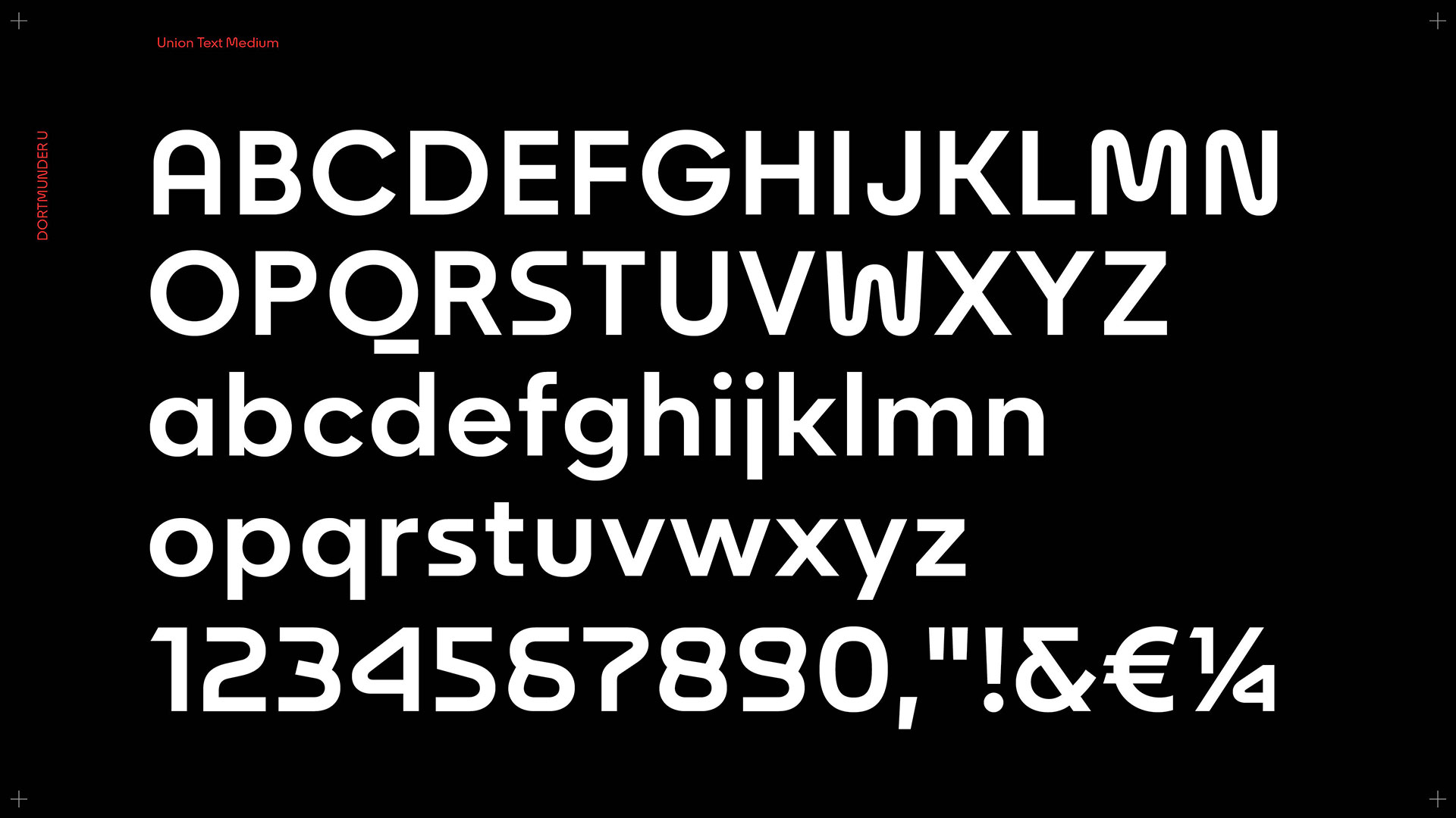
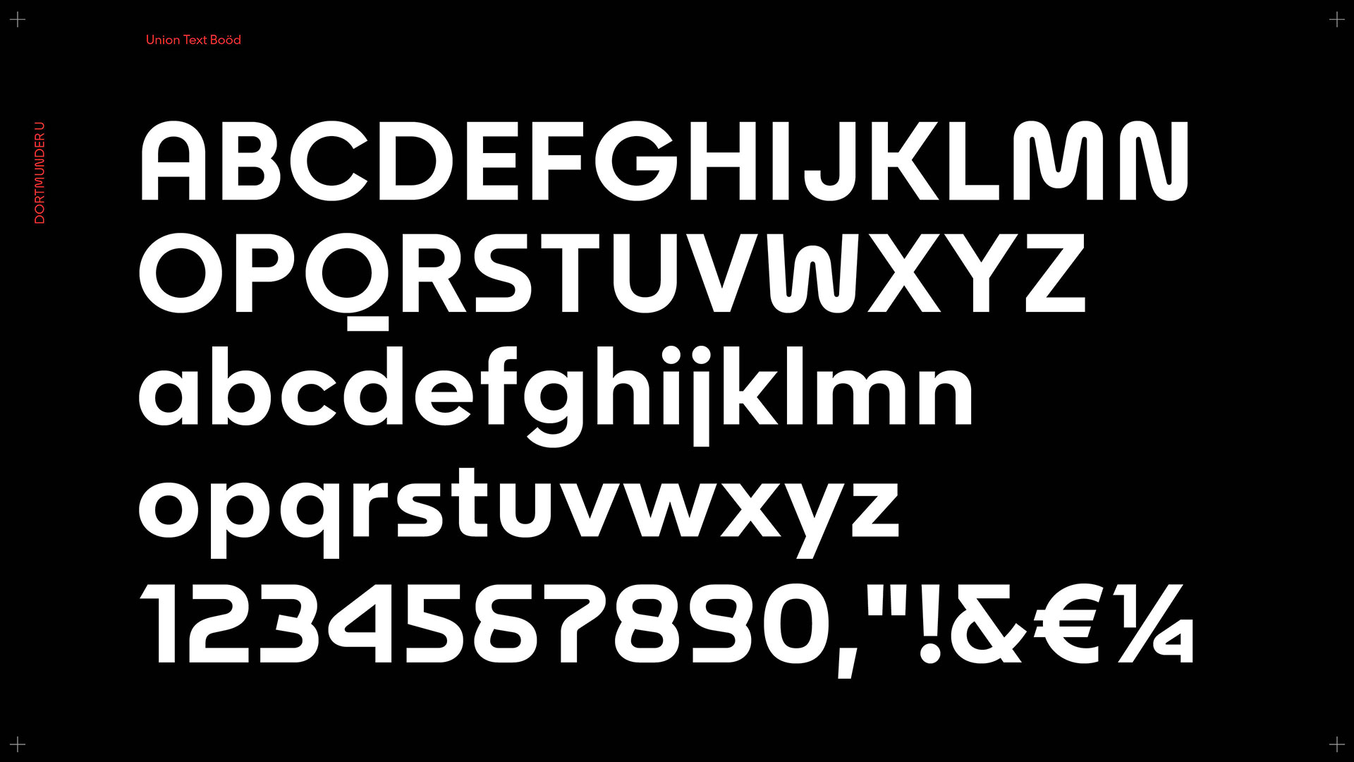
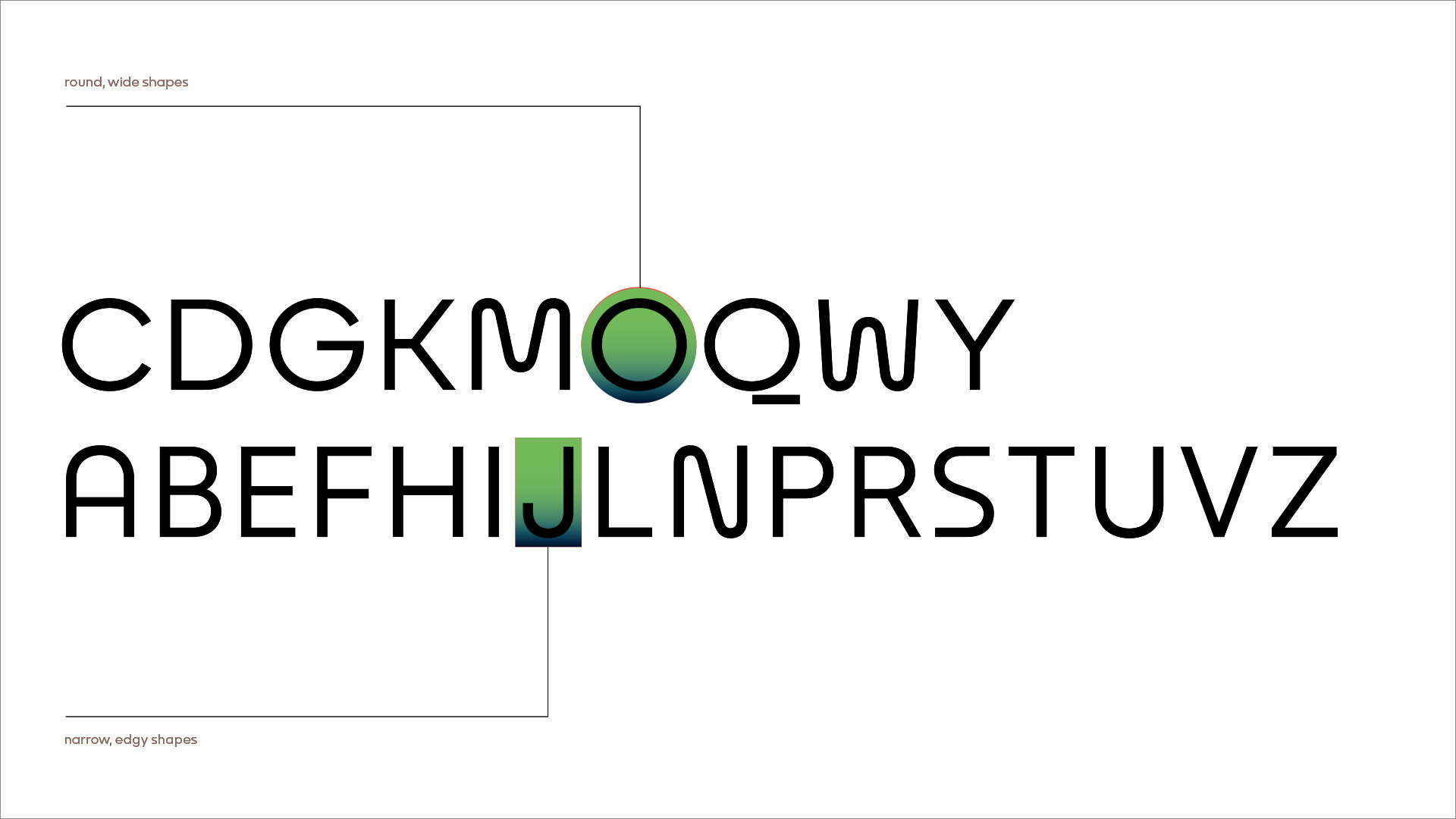
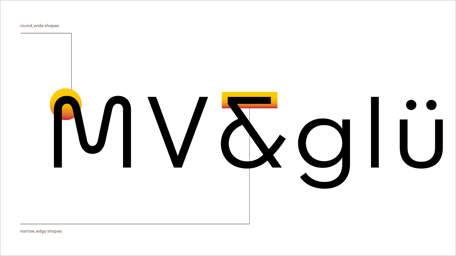
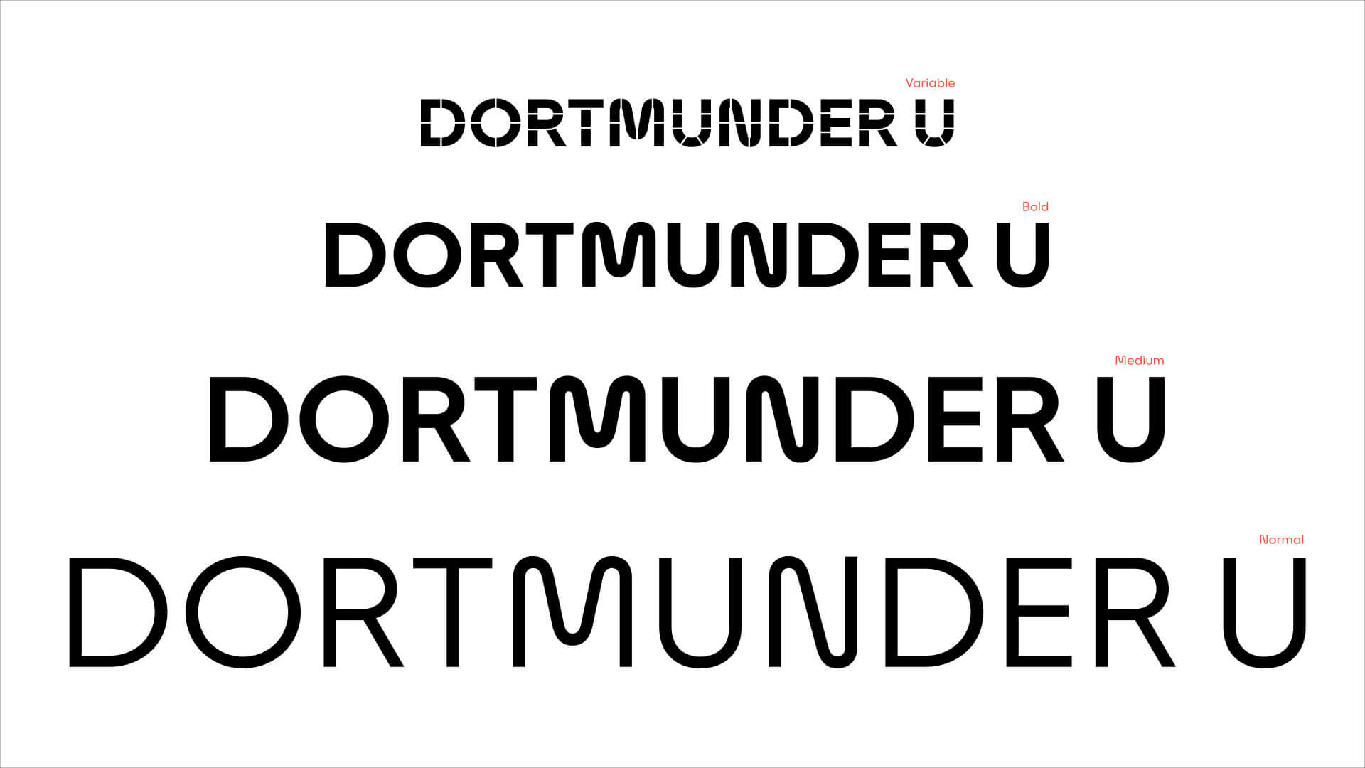
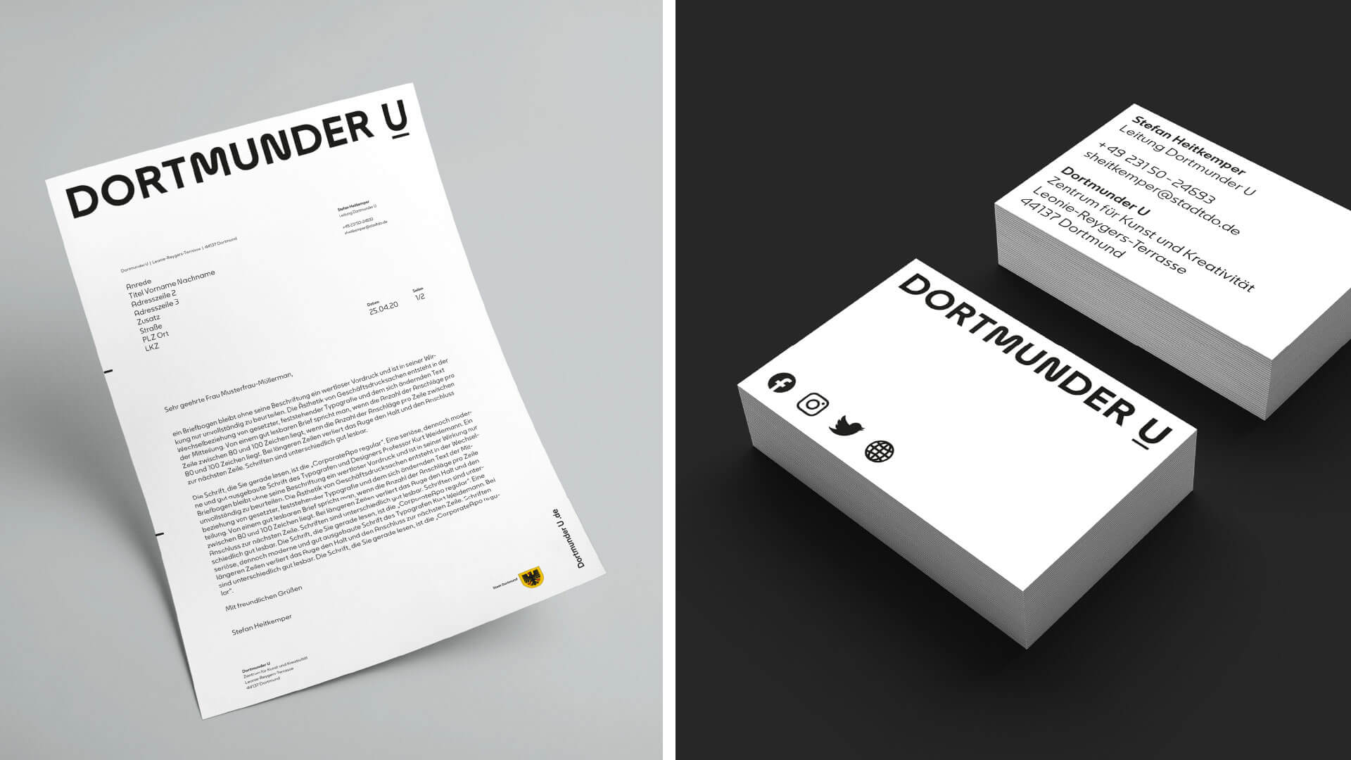
The use of typography is omnipresent in the communication of a company or institution. A custom typeface charges this statement with the brand’s philosophy and culture. Their character or expression influences any message and ideally strengthens its meaning.
For the Dortmunder U, we were able to work with type designer Alexander Roth to develop an exclusive typeface that not only reinforces the brand message, but also tells of the institution’s history. Find out more here.
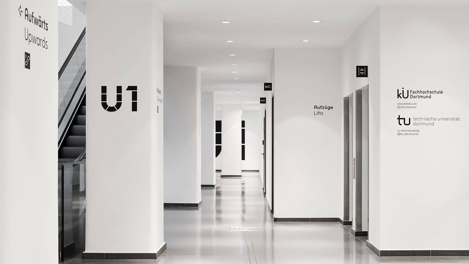
As a central element in the building, the new guidance and orientation system was designed with the house font. Find out more here.
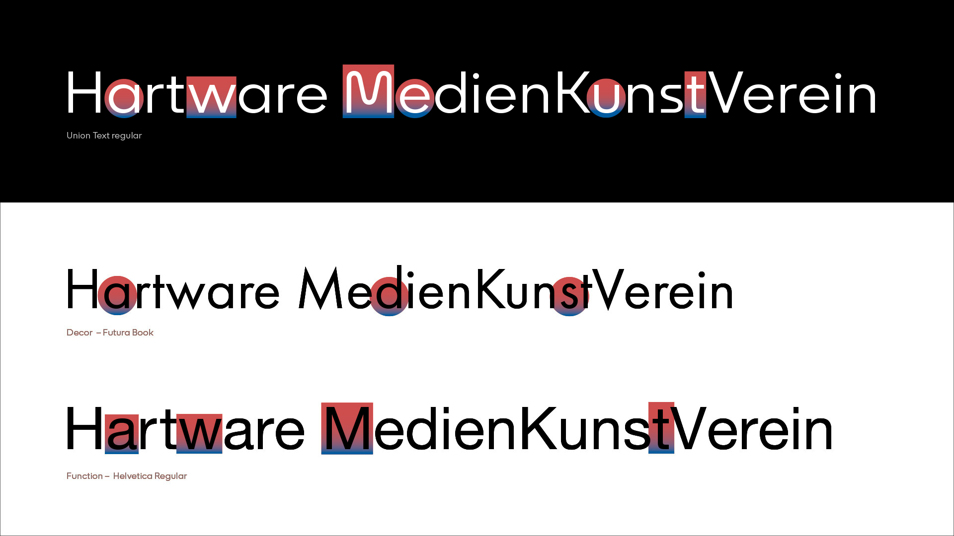
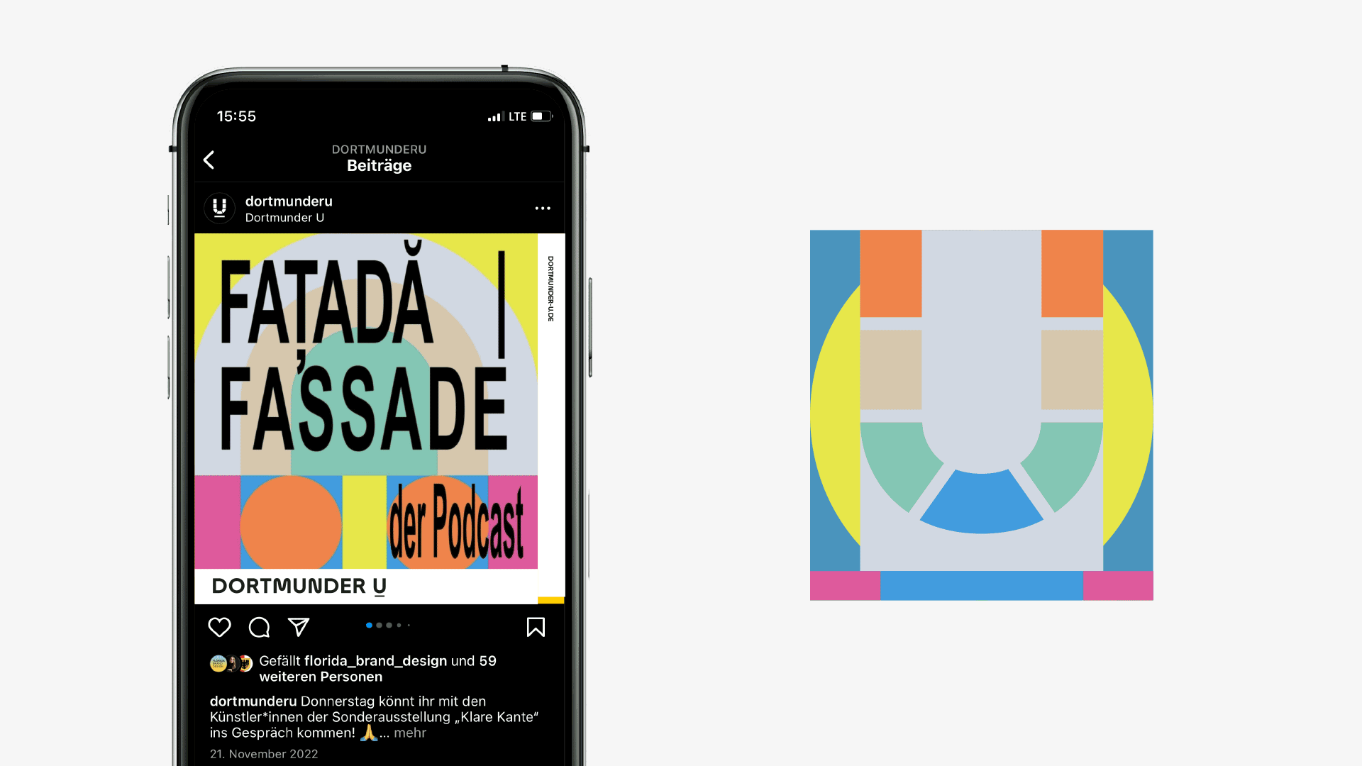
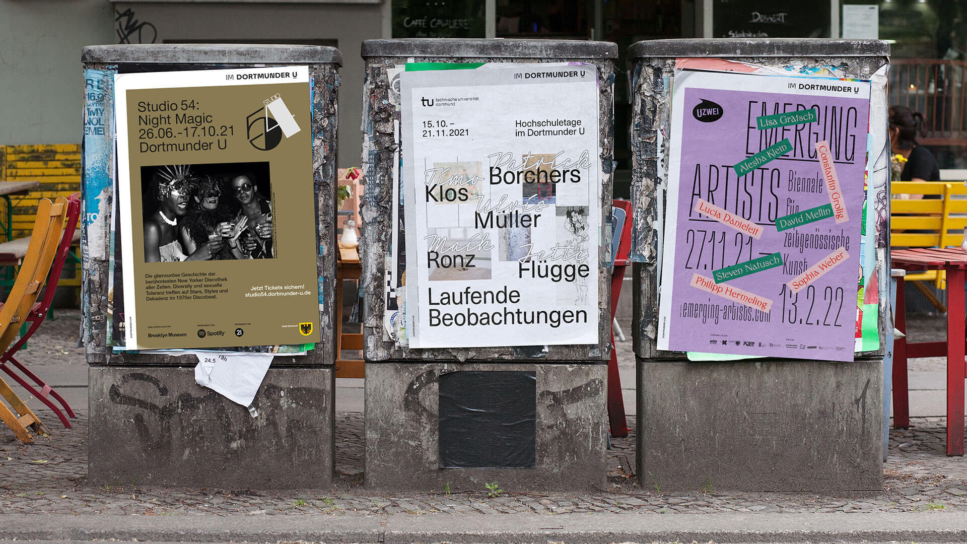
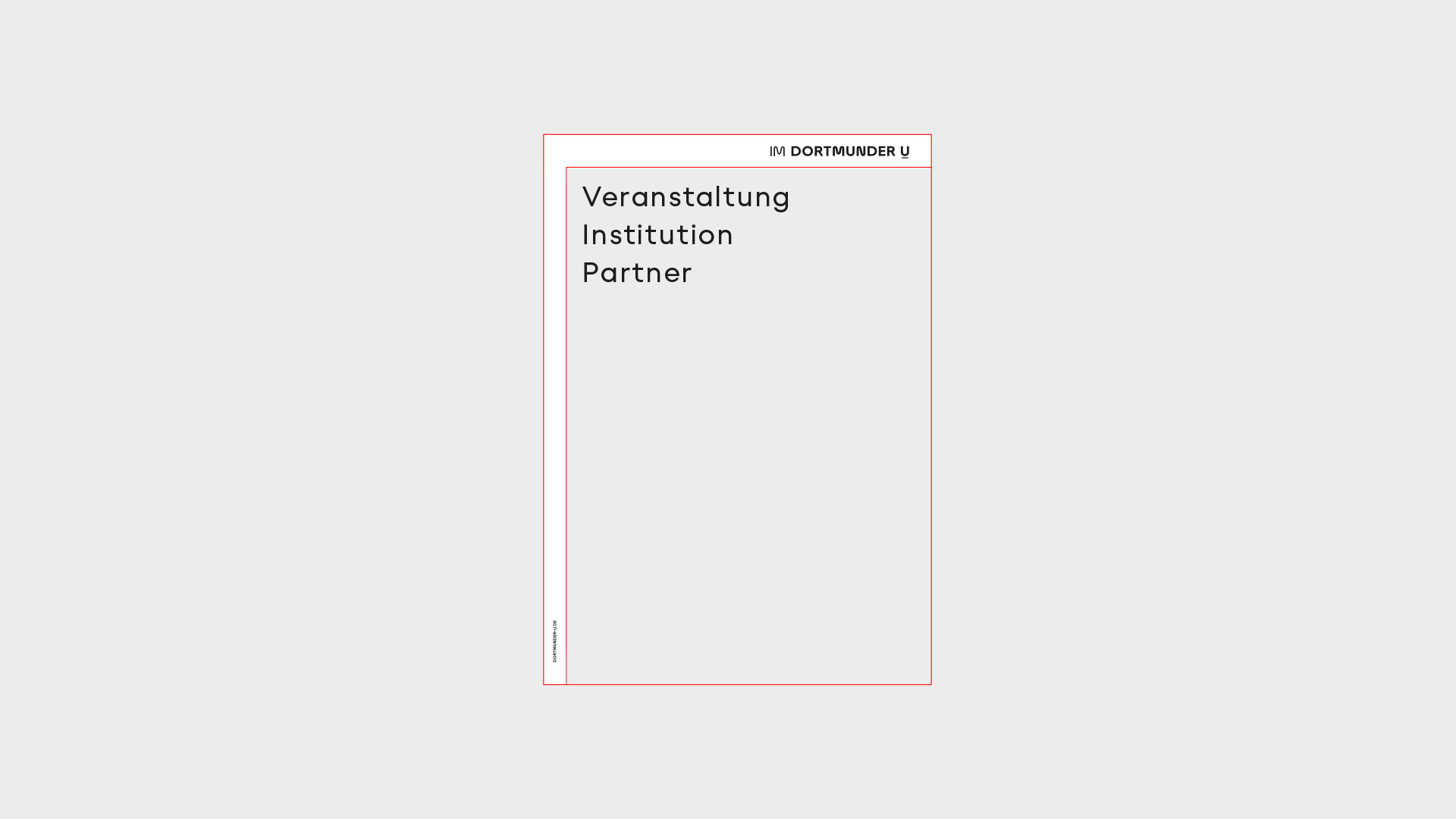
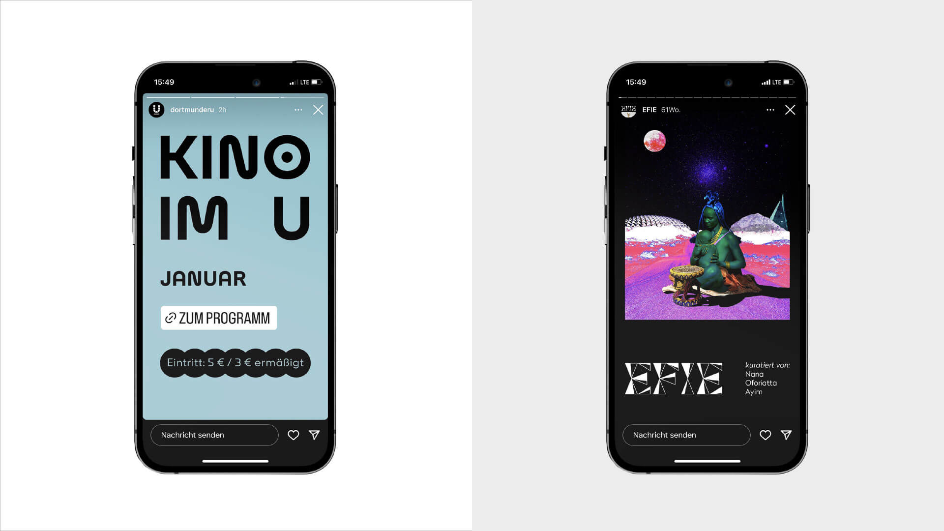
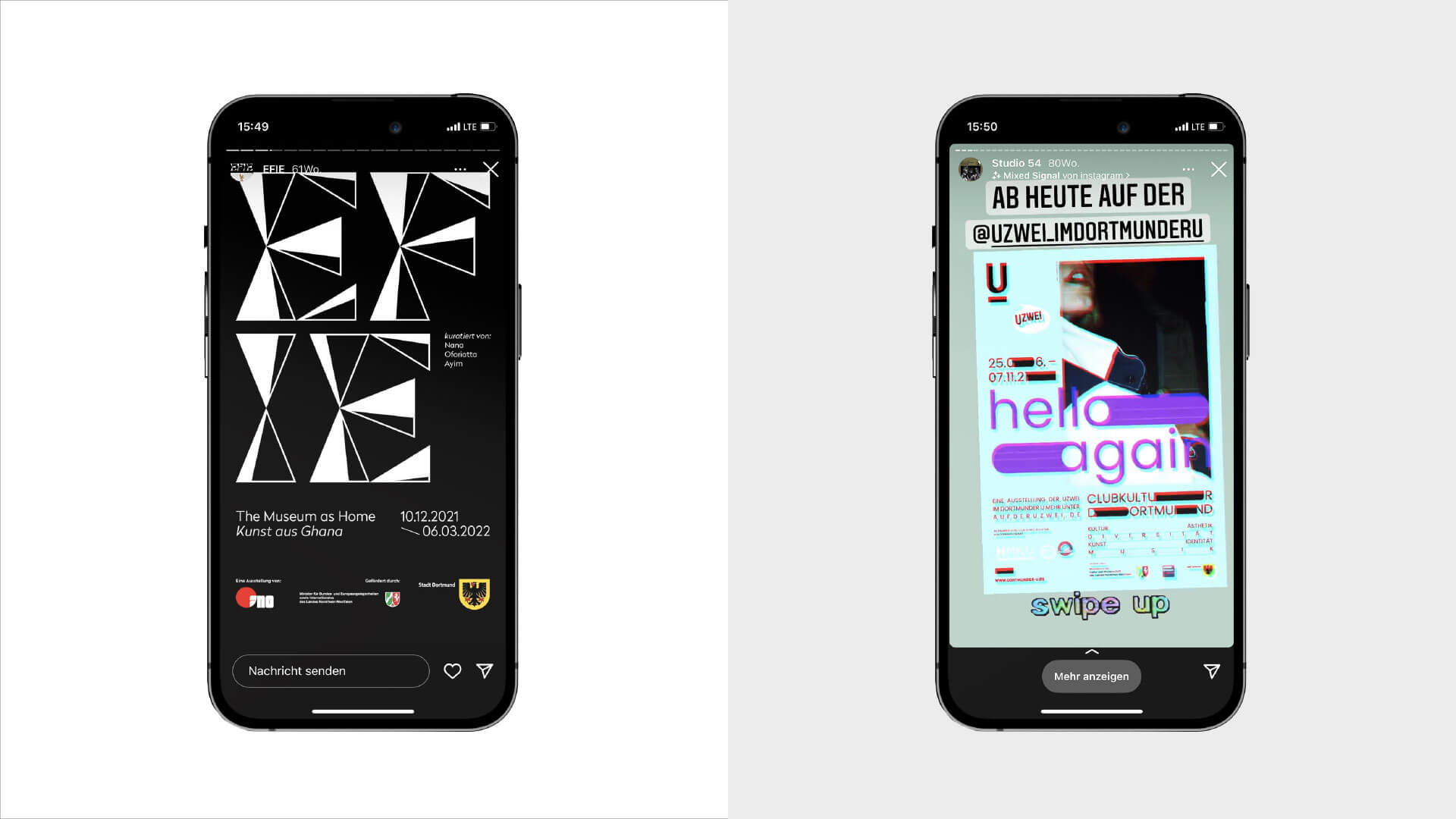
Communication with the CoBranding System
For a clear separation of the different levels and localities, we were able to develop a co-branding system together with all stakeholders, which gives the sender more design space and freedom. This makes it clear to the viewer who is making the offer and where it can be found.
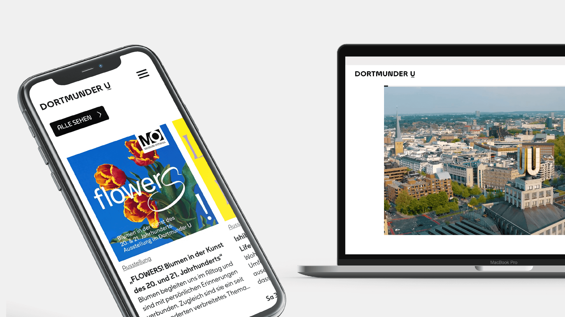
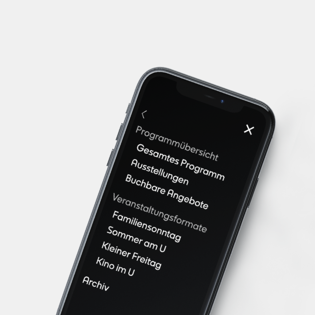
More programme, more orientation, more activation
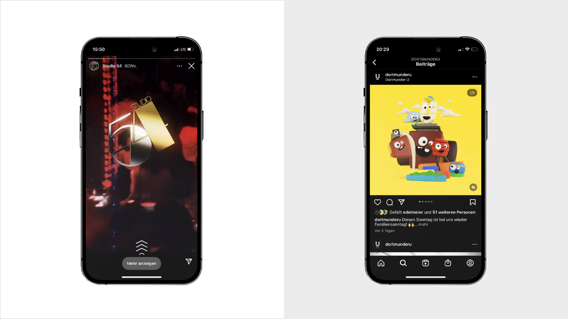
As a milestone of the new corporate design & identity process, we were able to develop a new website together with the team of the Dortmunder U, which is optimised to the needs of the visitors and transports the offers to the appropriate target group. You can find out more here.
Type design & cooperation with:
Alexander Roth, neue foundry
For further reading:
Why public spaces need to develop their own identity.