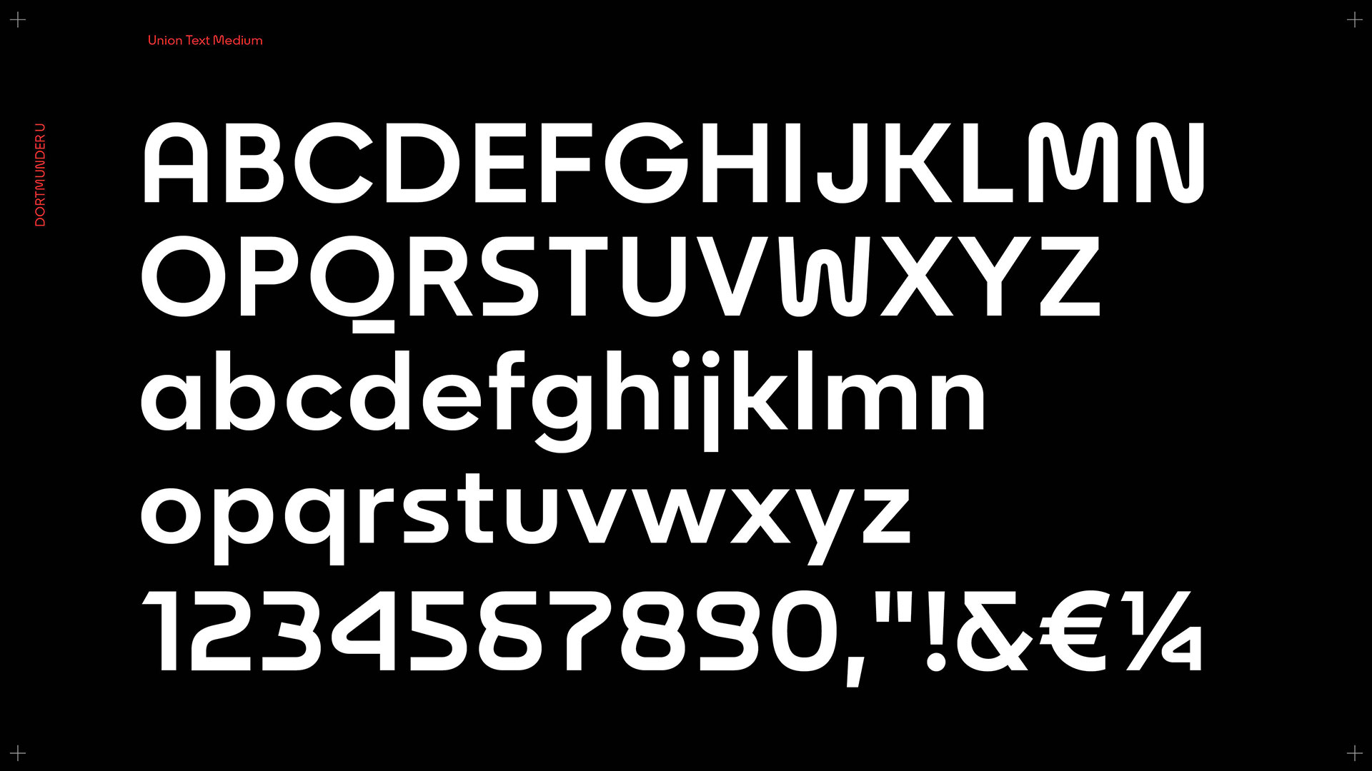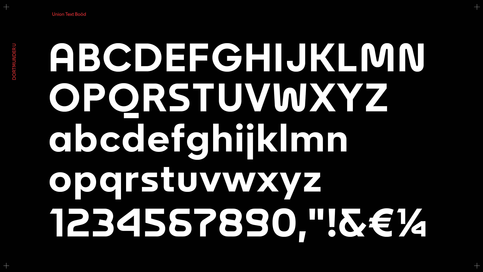
In the beginning was the U – Florida develops a custom typeface for the Dortmund U.
Art and culture, Custom Type Design
The use of typography is omnipresent in the communication of a company or institution. A tailored typeface charges this statement with the brand’s philosophy and culture. Their character or expression influences any message and ideally strengthens its meaning.
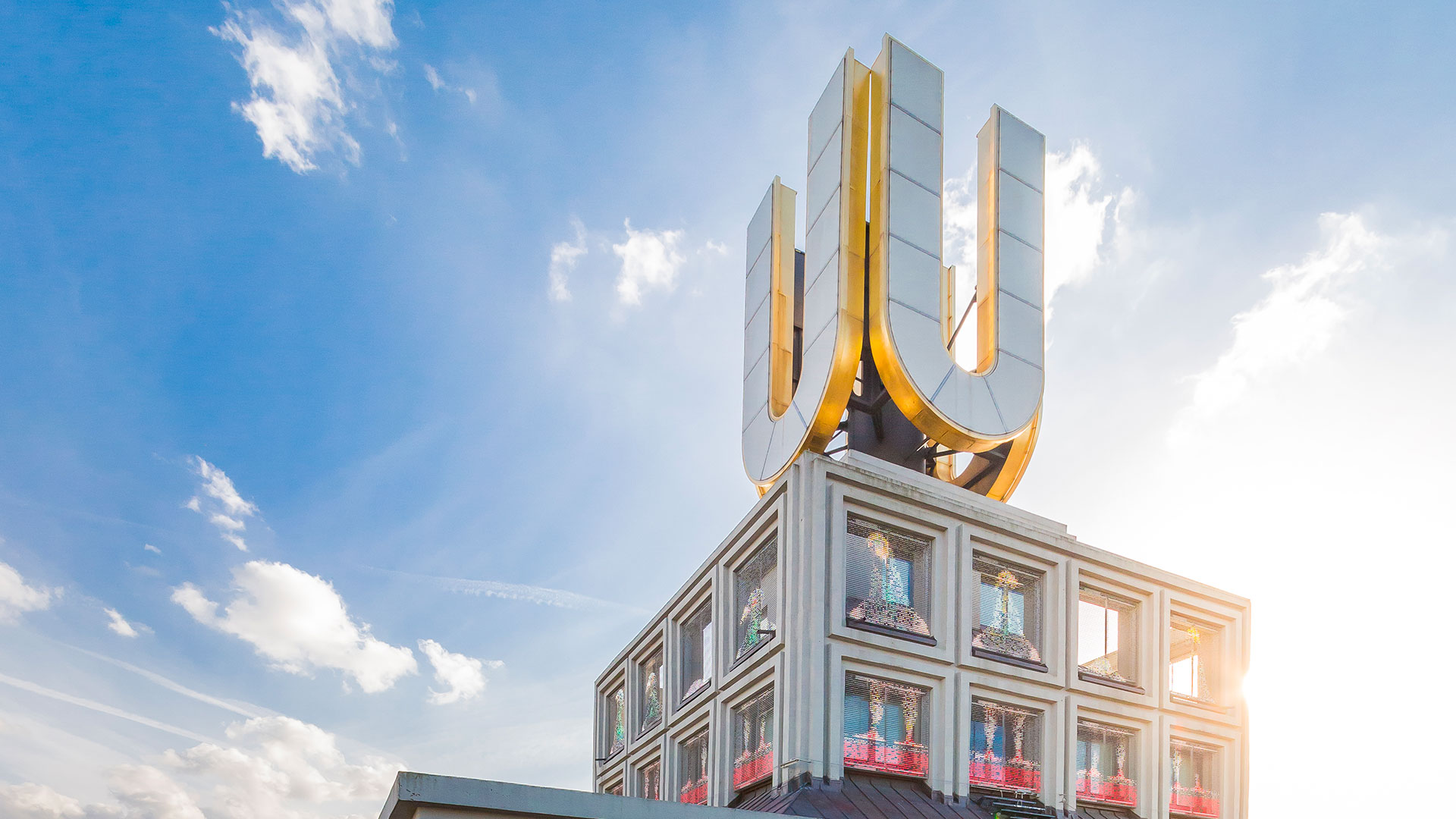
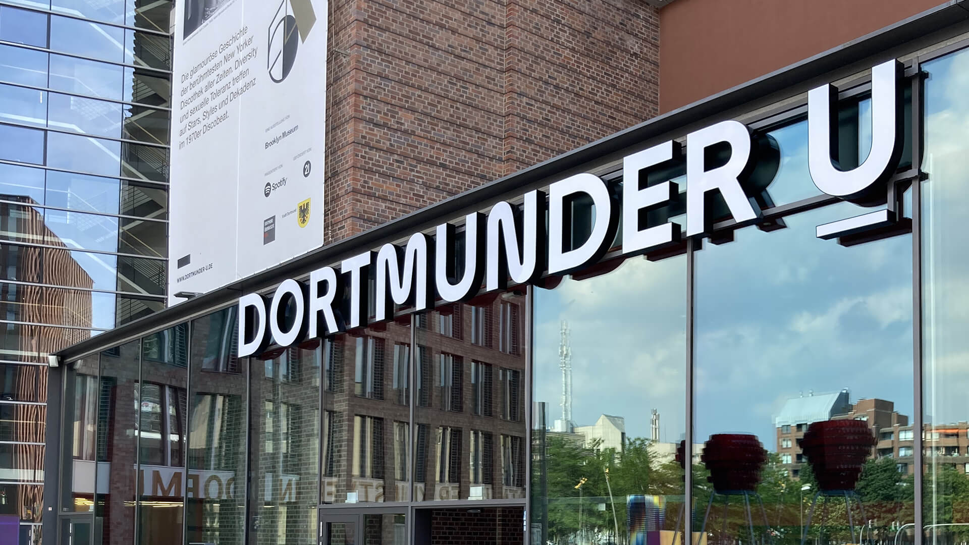
For the Dortmunder U, we were able to work with type designerAlexander Roth to develop an exclusive typeface that not only reinforces the brand message, but also tells of the institution’s history.
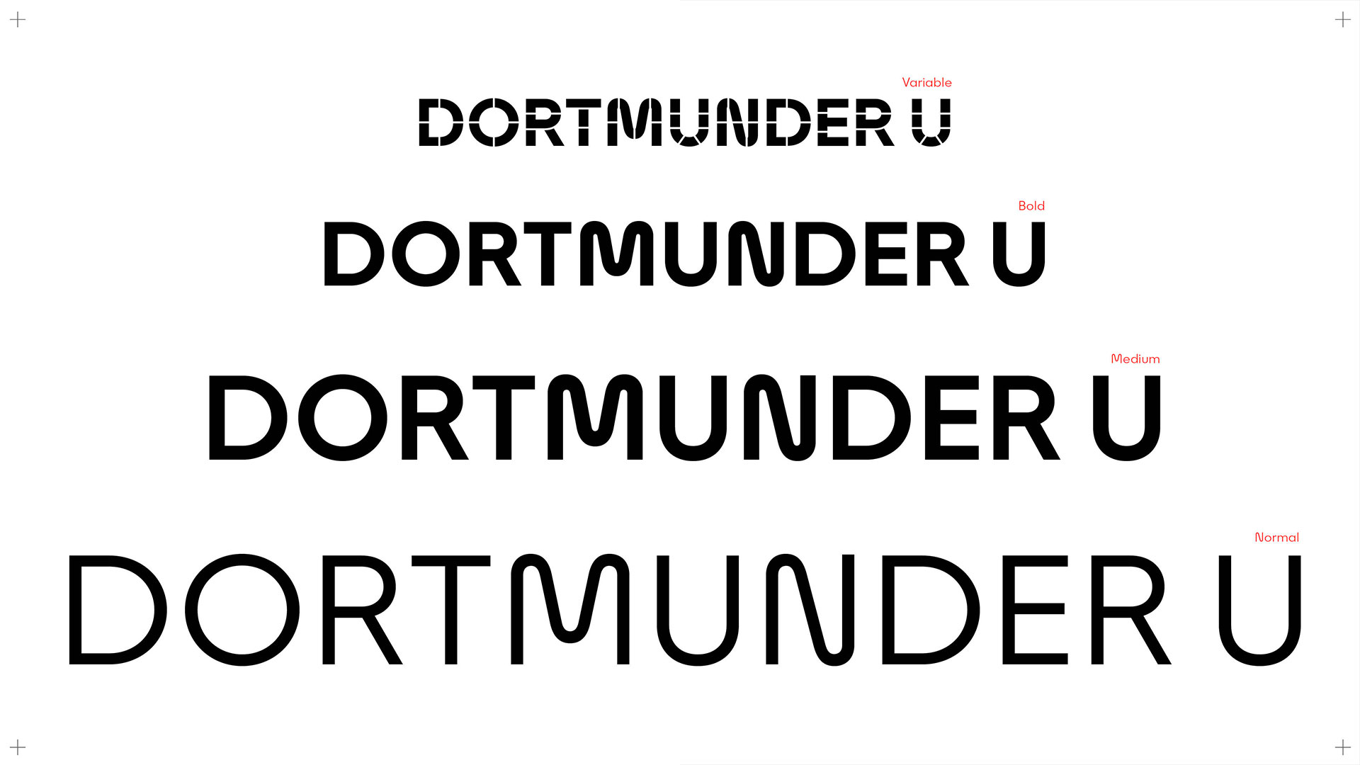
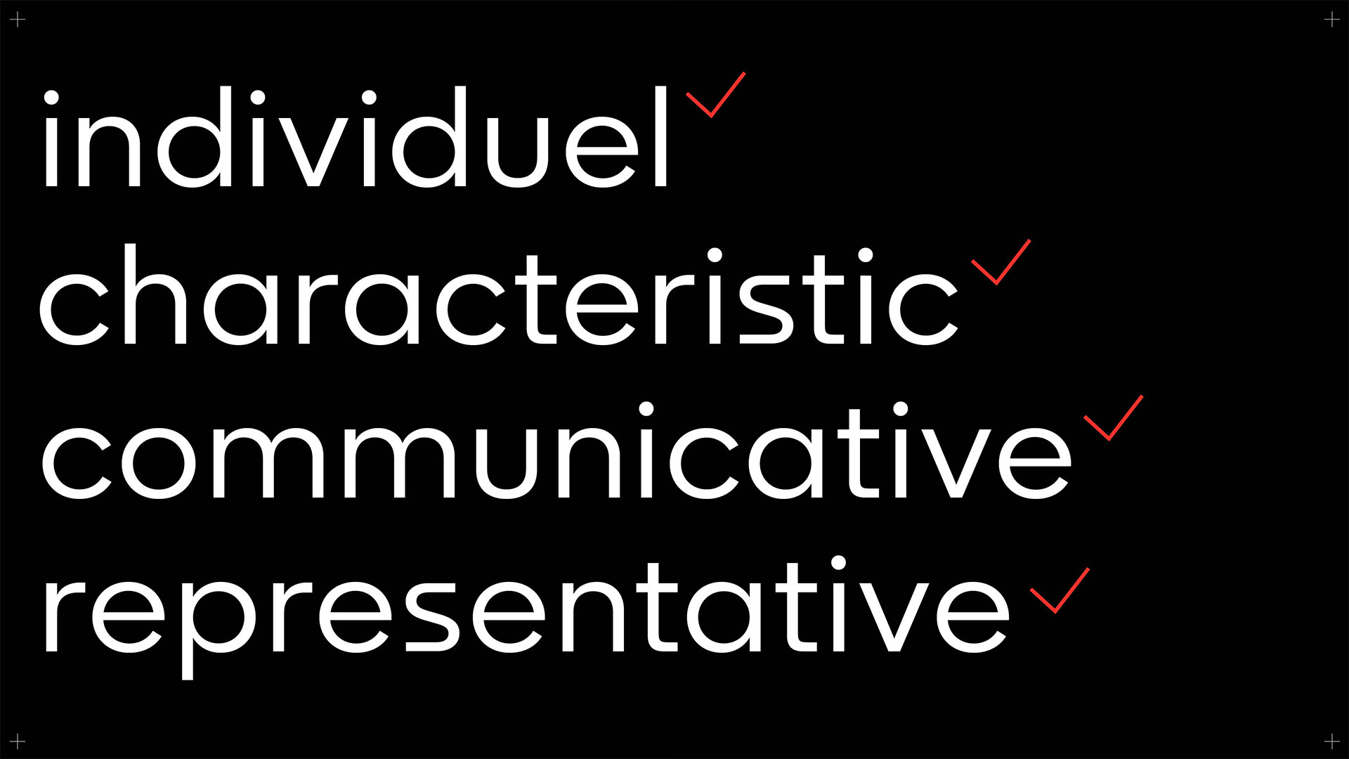
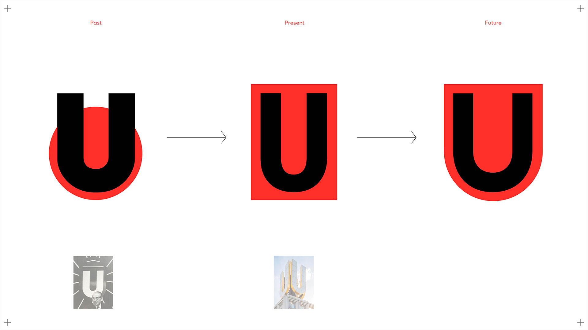
History, present and future in just one letter.
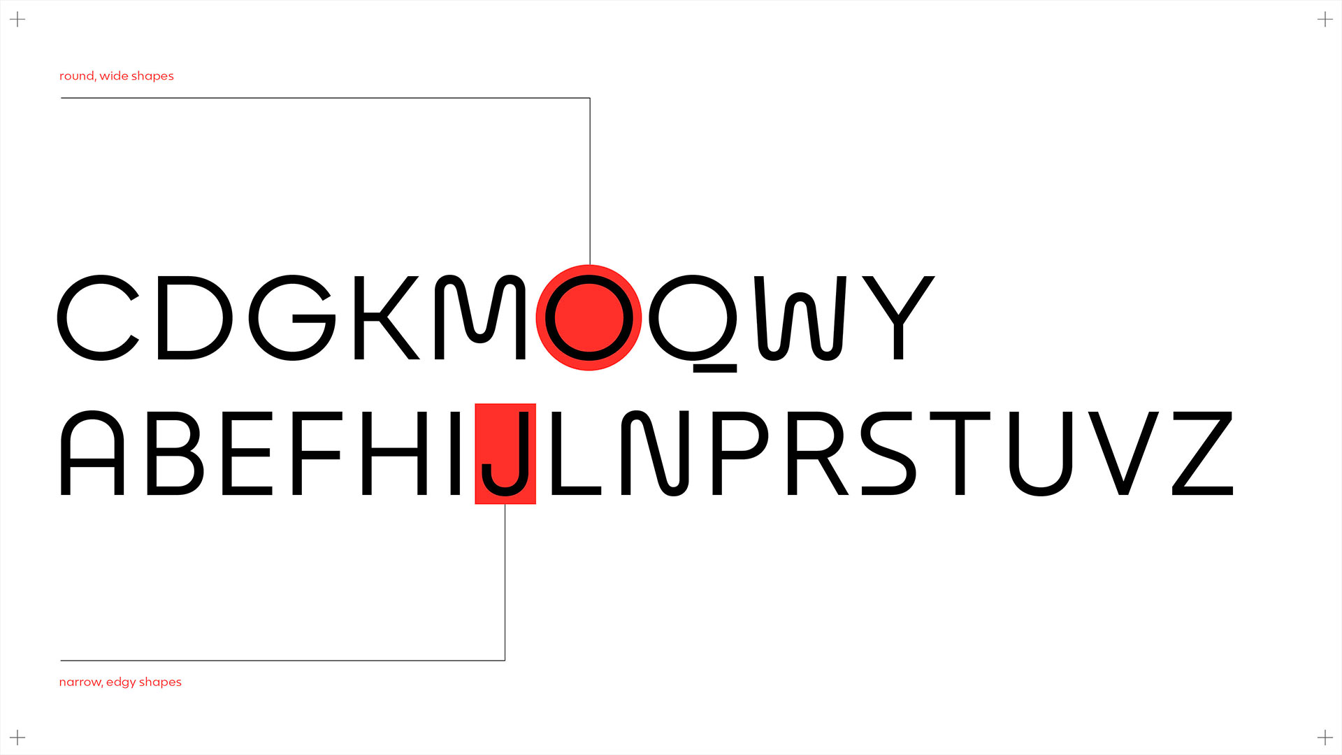
The basis for the character of the Custom Typeface Dortmunder U should of course be the historically grown U, which gives the building its individual character and name. Since a “U” alone is not sufficient to derive a complete script, the missing design features, such as the construction of other letters and their rhythm, had to be researched using historical material. This typo-archaeological inventory served as inspiration and leitmotif for the alphabet of the new Dortmunder U exclusive typeface.
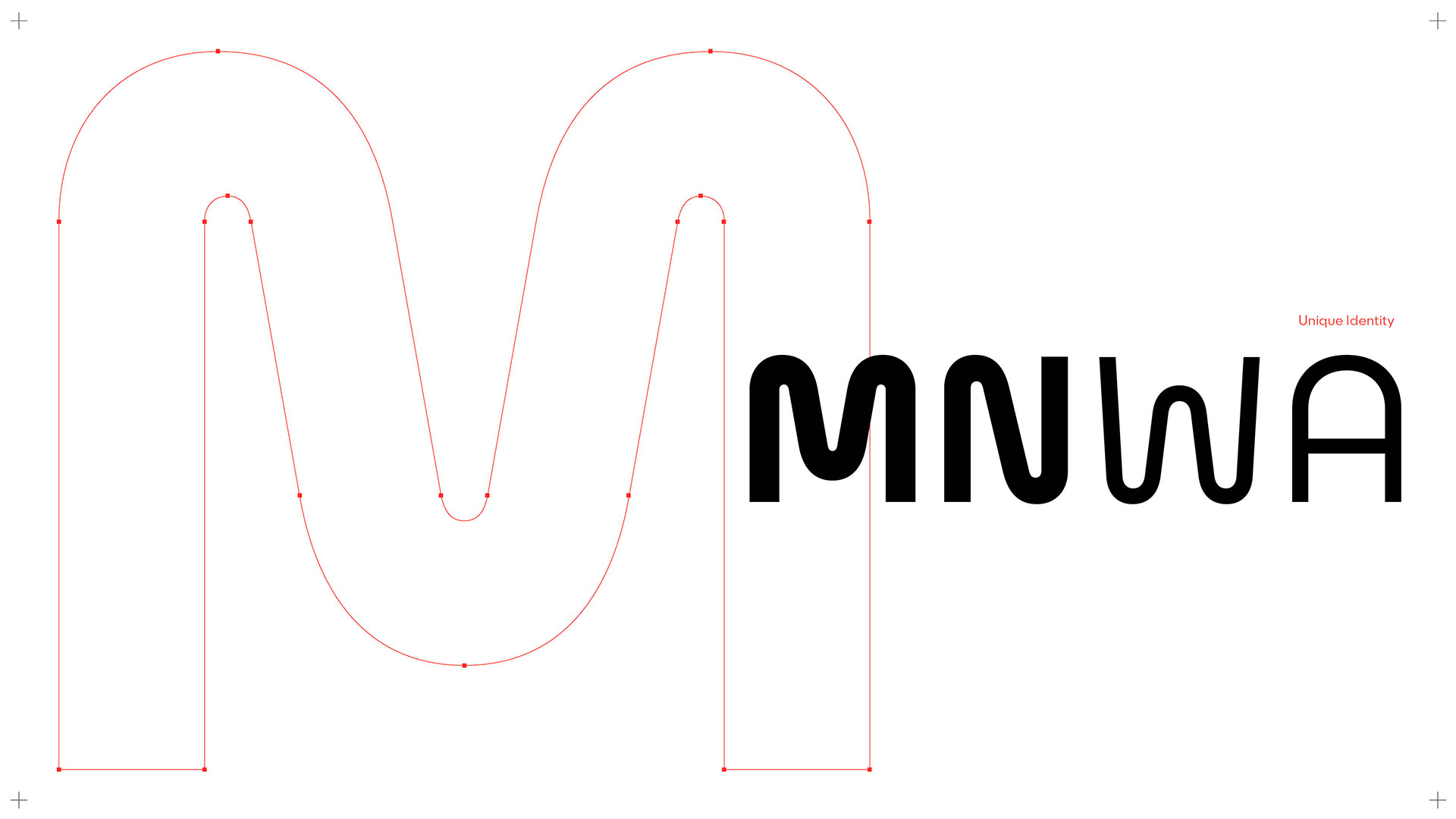
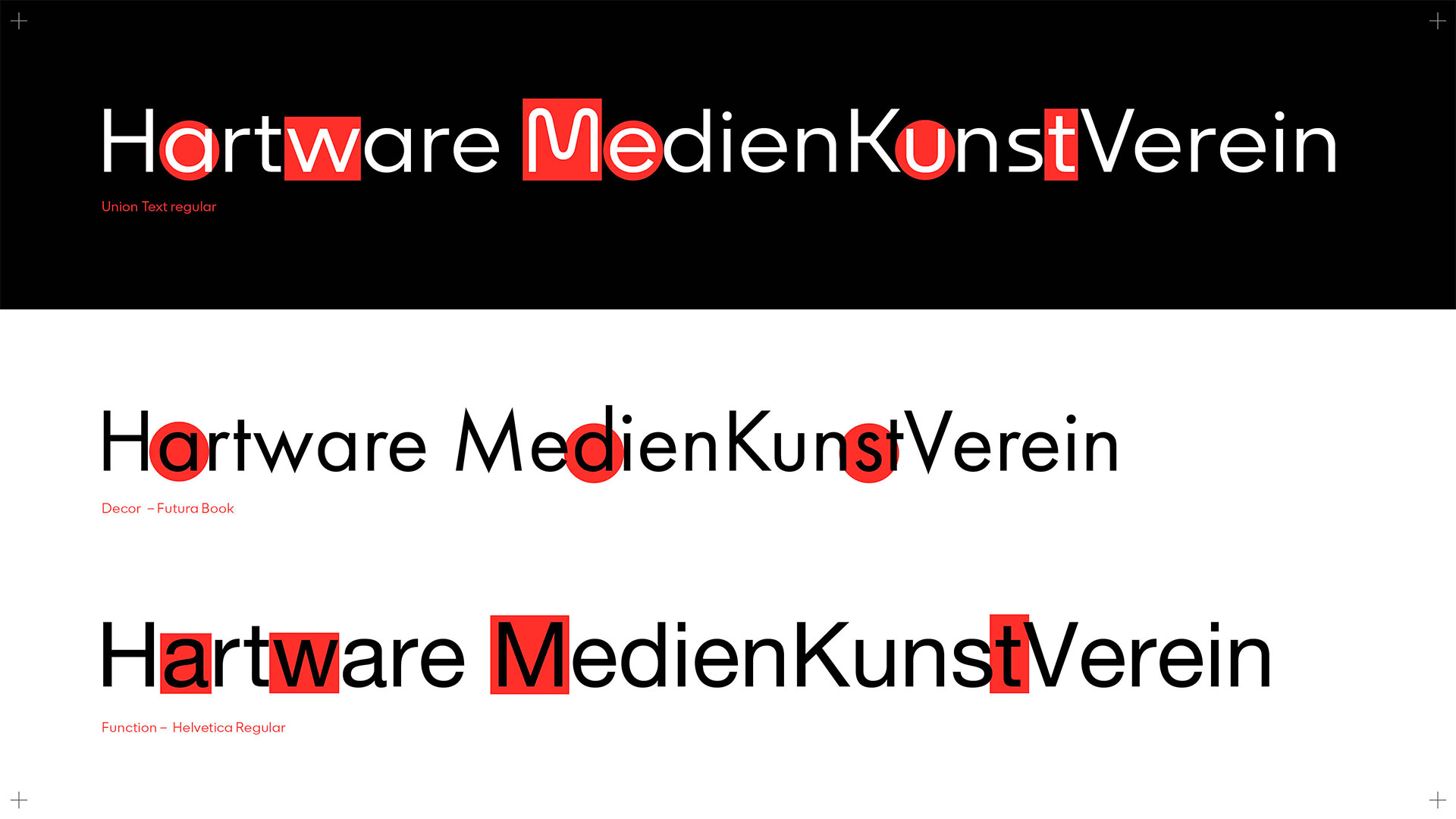
Brand character through individuality.
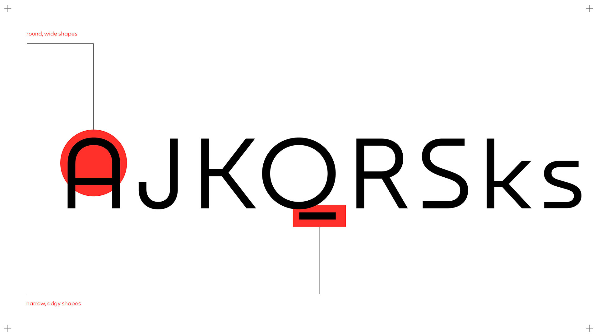
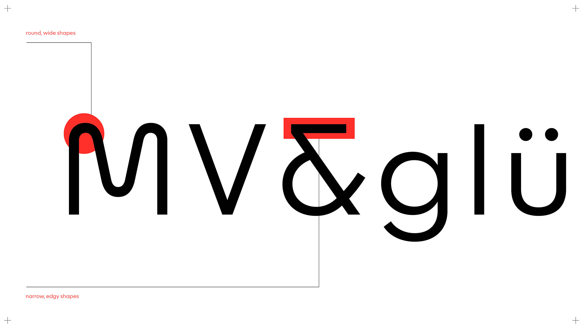
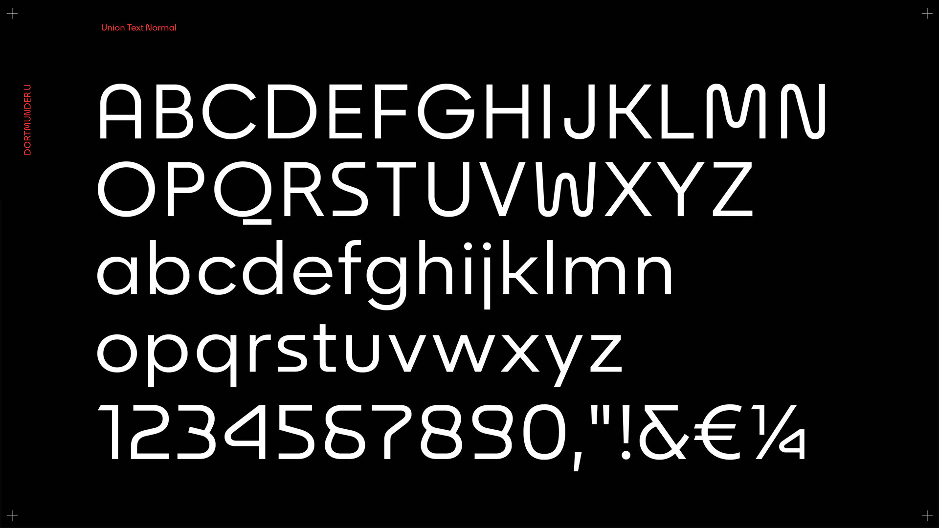
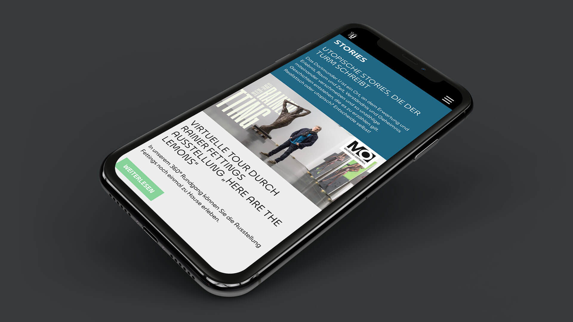
While uppercase letters are very robust due to their construction and allow a lot of design freedom, lowercase letters are subject to strong reading conventions. Accordingly, the shapes are kept emphatically classic. For the entire typeface, an attempt was made to convey the formal language of the letters in the numerals as well. The scattering of the characteristic U element results in an unusually soft and characteristic design language.
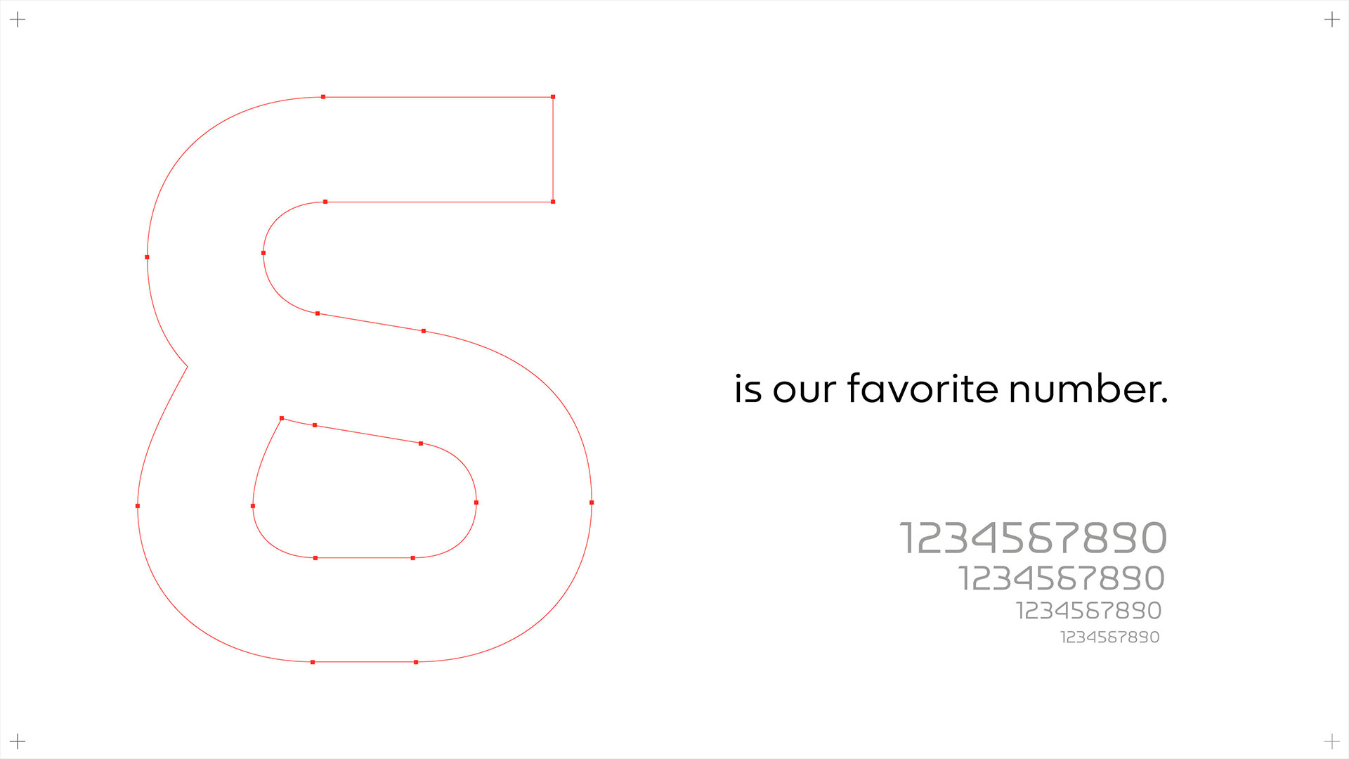
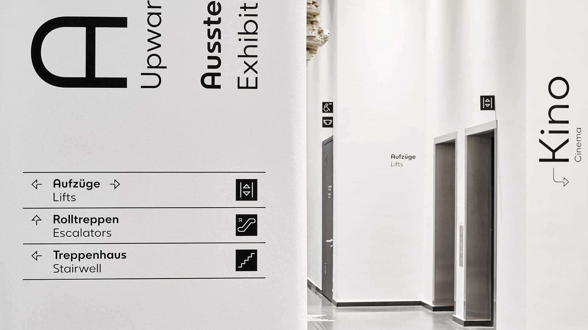
A custom typeface for the Dortmund U, an attention-grabbing brand ambassador.
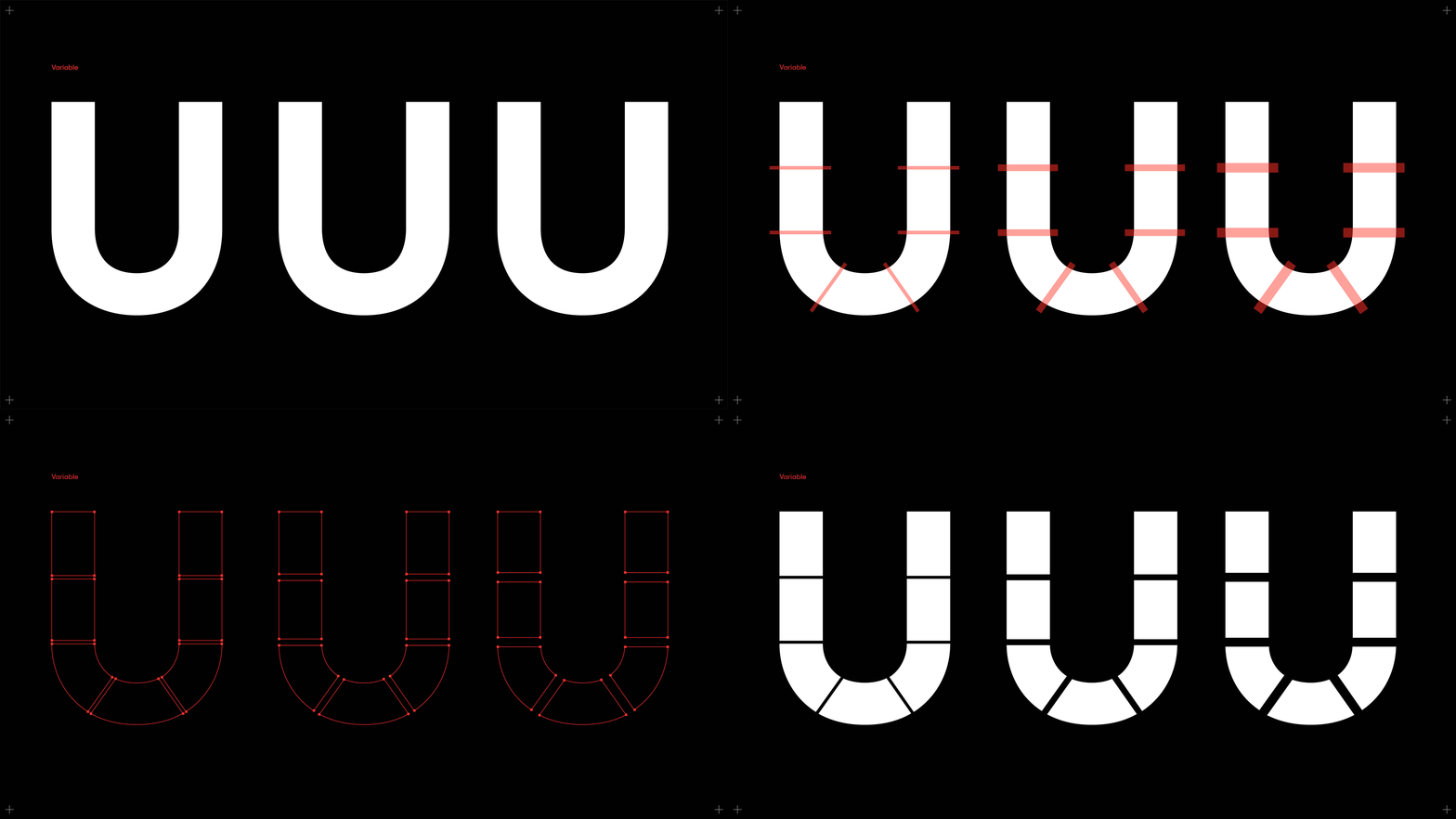
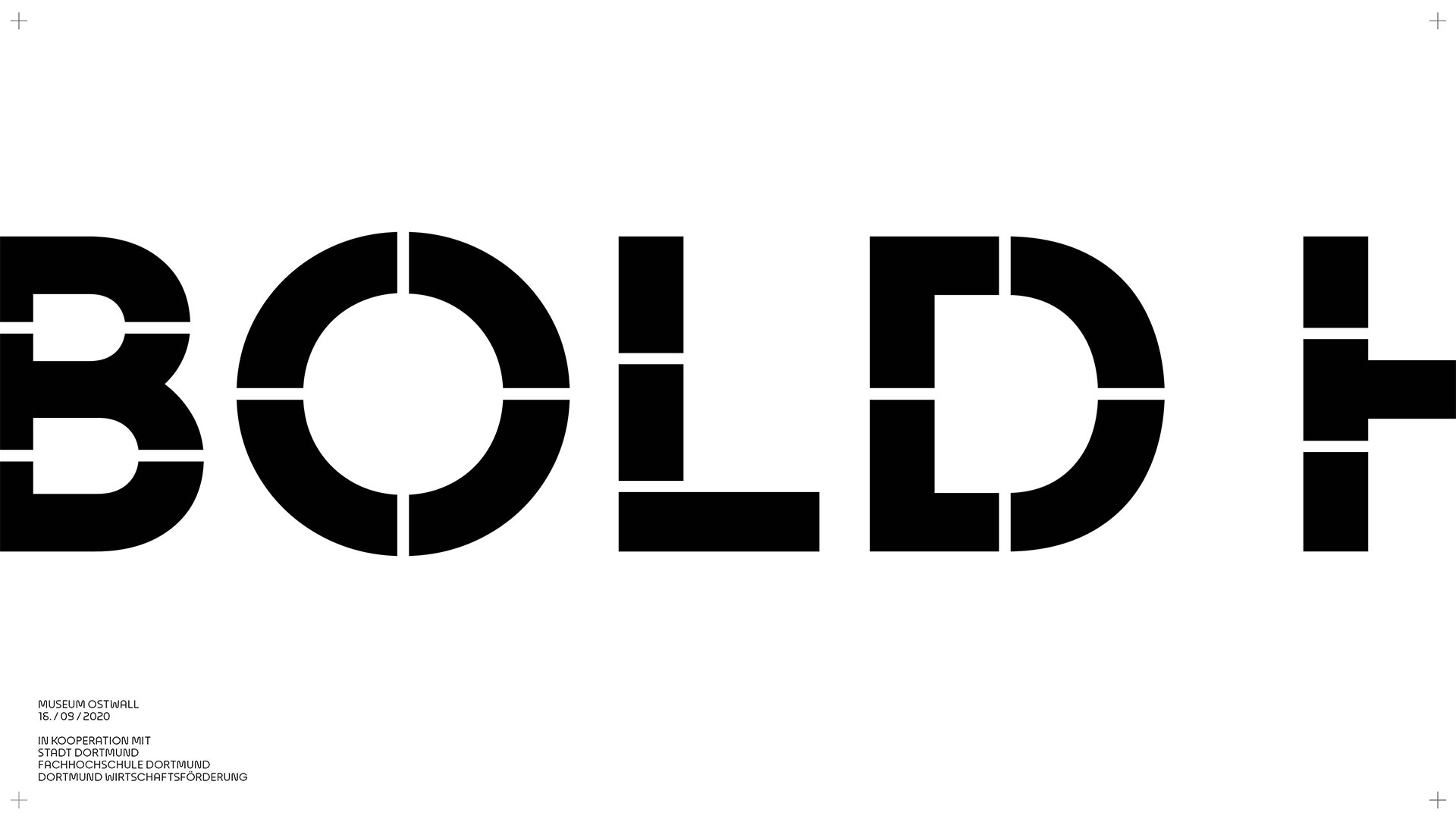
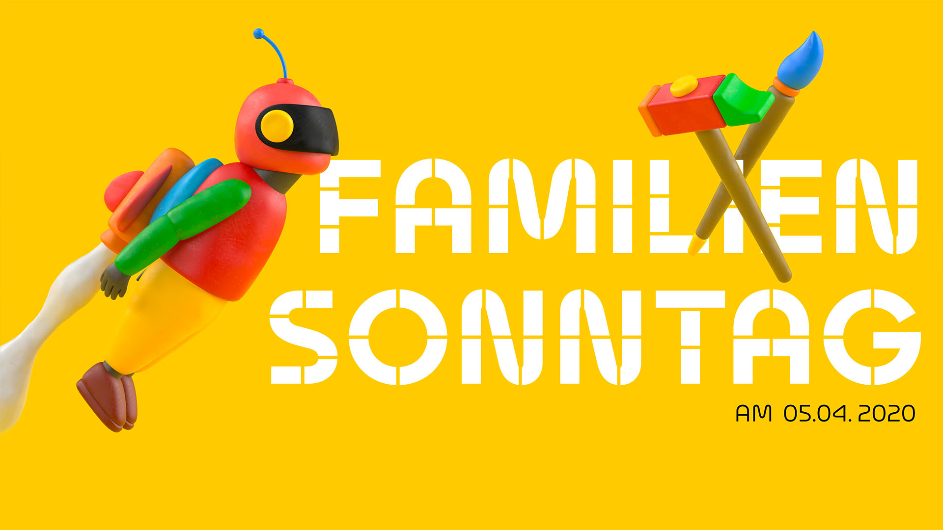
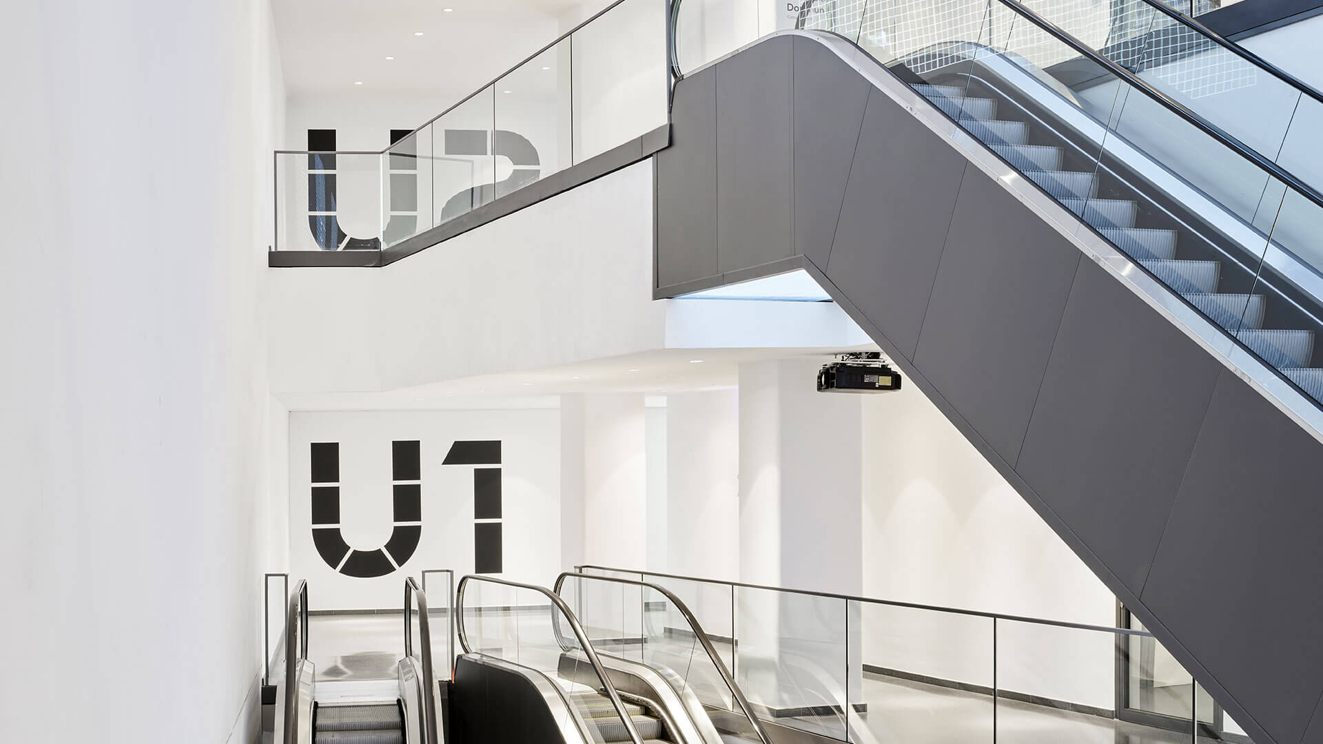
For particularly large applications, the “U Display” was also developed – a family of letters interspersed with bars that symbolically quote the fragmented U from the roof of the building.
“We are happy about the opportunity to visually strengthen the identity of the Dortmunder U and make it easier for people to access. The building has an exciting history, which served as a great basis for developing the in-house typeface. Through our collaboration with typeface designer Alexander Roth, the Dortmunder U is given a design element that ideally reflects its character and will accompany the building as a brand ambassador for years to come.” Translated with www.DeepL.com/Translator (free version)
Florian Carevic // Managing Director of Florida Brand Design
Type design & cooperation with:
Alexander Roth, neue foundry
For further reading:
Why public spaces need to develop their own identity.


